How to Boost Conversion Rate With a Call-to-Action Button

How to Boost Conversion Rate With a Call-to-Action Button
Contributed ContentYou want to set yourself apart from other websites, and the call-to-action button is an important marketing strategy. What does it take to make your CTA button distinct? Follow these guidelines, and you’ll be one step closer to increasing your conversion rates.
Close your eyes and count to three.
That’s how long it takes users to see a clear call-to-action (CTA) button on nearly 50 percent of live websites.
Does your call-to-action button stand this test?
If it does, you’re on the right track. But the success of your call-to-action button will be measured by whether people click it.
You want to set yourself apart from other websites. And the call-to-action button is an important marketing strategy. What does it look like to make your CTA button distinct?
In this guide, you’ll see excellent examples of what works — and what doesn’t. Each example will show an effective strategy you can implement for your call-to-action button. Follow these guidelines, and you’ll be one step closer to increasing your conversion rates.
1. Put Your CTA on the Landing Page
You have a stunning CTA, but you’re not happy with your conversion rate. Why the low numbers?
Maybe your CTA is nestled behind a landing page with a massive navigation menu.
Don’t hide your CTA. Make sure it is the first image your customer sees. Spotify has an especially prominent CTA on its landing page:
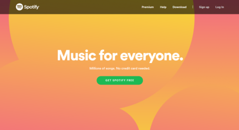
Spotify takes special care to make the CTA prominent, tasteful, and direct – giving it special emphasis by making it green.
Having a CTA on your landing page increases conversion rates by 80 percent. Who doesn’t want increased revenue and product sign-up? It’s all yours with this quick fix.
2. Keep Your CTA Simple
It may seem easy for Spotify to keep the call-to-action simple. After all, it only offers one product.
If your business offers more services, it is tempting to present customers with all their choices and then let them decide.
Don’t make this mistake.
You don’t want to overwhelm the consumer with too many choices because it will decrease your conversion rates. Keep it simple. Mozilla once allowed complexity to run amuck:
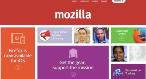
People likely came to Mozilla’s page to download Firefox, not to buy apparel. Simply spotting the download button took far too long.
Fortunately, Mozilla learned and adjusted to a less cumbersome landing page:
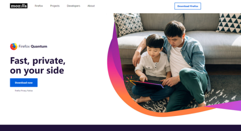
Here, the singular CTA is prominent, simple, and effective. Your business should seek to do the same.
3. Actionable Texts for Lead Generation
CTAs are named a call-to-action for a reason. You want the user to act now. The aim is to make shoppers feel like you’re talking directly to them. Otherwise, you can end up with a nebulous CTA:
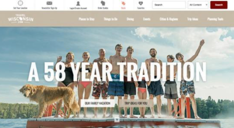
Why use “our family vacation” as a CTA? What does this convey to the user? It’s vague, it doesn’t provide a clear direction, and it doesn’t offer much value to shoppers.
Here’s how these issues can be addressed:
- Use active language: “buy now,” “click on,” “subscribe to,” and “register now” all direct the audience to undertake specific behavior
- Create a sense of urgency: Provide a specific date to take action by
- Use power words: "Get," "buy," "shop," "try," "learn," "build," "sign up," and "discover" are all power words
Equinox, in particular, demonstrates how to use active language, create a sense of urgency, and use power words:

Shoppers may not know exactly what it means to “get it back,” but the compelling image, “offer ends” date, and power words make for an effective advertising.
Businesses should always give shoppers compelling reasons to act.
4. Make Your CTA Easy to Understand
If you have a simple layout and invoke power words, you’re halfway to properly deploying an effective call-to-action.
Next, you need to properly crystallize your call-to-action. Look at your CTA and determine if it is clear. Here’s an example:
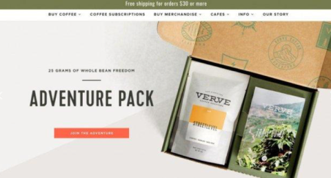
At first glance, this appears to be an ad for a safari. In reality, it’s about coffee.
A serious opportunity is being squandered. The product for sale is coffee – a popular and fairly ubiquitous commodity. Doesn’t “Get Your Brew” sounds better?
Here’s an example of a crystal-clear CTA:
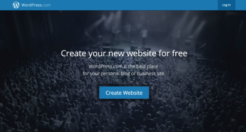
Note that the call-to-action mirrors language already used and incorporates a power word and action verb.
A crystal-clear CTA will reduce shopper confusion and boost user engagement.
5. Personalize Your Words
If you pass the three-second metric and users see a clear CTA, it may seem like you’ve done everything you can.
Still, even well-designed CTAs like the one below from iMPACT, a marketing agency, require personalization.
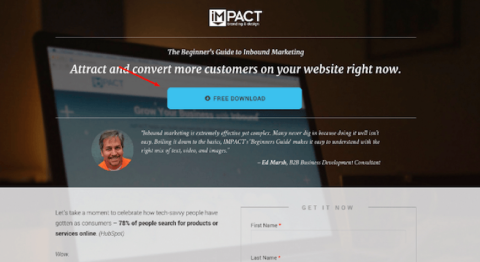
Personalized CTAs perform 202% better than basic CTAs. Here’s what the same CTA looks like with a personalized makeover:
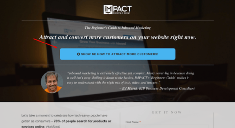
There is a subtle but important difference. Instead of offering a “free download,” the personalized CTA promises to show shoppers “how to attract more customers,” which is a much more compelling and direct message.
iMPACT saw a 78.5% increase in conversions after its makeover. What did iMPACT do right, and how can you implement the same changes?
Think about what value you bring to the user. What’s in it for them? Say you have an informative and engaging surfing blog. What text should you use? Try this: "Join the surf squad."
By providing a personalized message, your CTA can engage customers.
6. Incorporate Color
You want to convince the user to purchase or download something. First, you must catch their attention. How can you tell the audience, “hey, eyes over here”?
Design a colorful CTA.
The number of color combinations, gradients, shadows, fonts, kerning, and other options is infinite. There is no one answer to the best color choice to make.
Still, it is possible to operate off a quick color-choice checklist. The most important rule: Don’t make your call-to-action white, gray, or black:
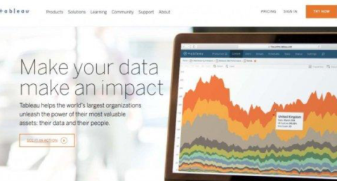
Tableau’s call to action is barely visible, and violates each of point on our color-choice checklist:
- The call-to-action needs to be a solid color.
- The call-to-action needs to stand out from the background.
- The call-to-action should not clash with the background.
- The call-to-action must attract users’ attention.
The first Tableau CTA steers eyes away from the CTA. When Tableau does follow the checklist, the results are much better:
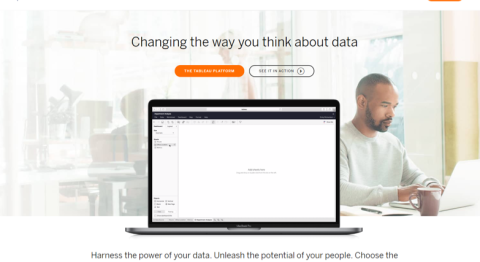
The difference is stark. With color, the visibility of the CTA improves, and an increase in conversions is quite likely.
Flex your creative thinking and incorporate color in your CTA to convince your user to take action.
7. Measure Your Button Size
Make sure your button is an appropriate size.
The call-to-action button should be noticeable but not outrageously large. Most of the CTAs we’ve seen so far have done a good job in choosing the correct button size. The button should blend in well with the background and placement of the CTA on your screen.
For e-commerce sites, there’s another concern. The “add to cart” button must be noticeable enough that shoppers don’t have to search for it but not so prominent that users find it tacky.
Here’s an example:
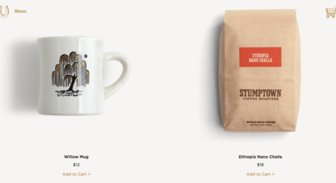
This button size is too small. Also, the size doesn’t work well with the color scheme and background. It’s better to have the CTA pop more. Here’s a good example where the button size works:
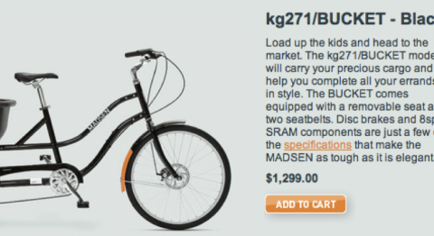
With a well-placed, prominent and bright-colored button, this bicycle retailer is likely to increase sales. Your business can similarly improve your sales by making your button easy to find.
8. How to Use Directional Cues for Your CTA
Directional cues enhance the user experience and nudge them to your CTA. Still, they optimizing directional cues is difficult. Take a look at this example of a bad directional cue and see if anything throws you off:
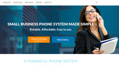
The gaze and body position are visual clues. They should direct attention to your CTA.
In the example above, the opposite happens. The model nudges visitors toward the site’s navigation, not the CTA.
What happens when body language effectively directs users to the call-to-action button? Take a look:
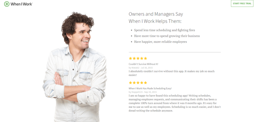
The man's gaze pushes you to the testimonial and to the call-to-action button in the upper-right-hand corner. Gazes, in particular, are effective body language cues because they seem more natural than points and other cues.
Harness the Power of Call-To-Action Buttons
Call-to-action buttons are powerful tools for boosting conversion rates.
Make sure CTAs are simple, colorful, well-placed, and personalized to fully capitalize on their returns.
