8 Call to Action Examples for Email Marketing

8 Call to Action Examples for Email Marketing
Here are 8 call to action examples for email marketing that will improve the success of your campaigns. Learn how to write email CTA’s that get results.
Copywriters spend a great deal of time crafting the perfect calls to action (CTA’s) for websites and landing pages. But writing effective CTA’s for email marketing is slightly different.
Email offers a very limited amount of space and time for you to compel your readers to engage. So your CTA relies heavily on the content surrounding it and the context in which it’s presented.
In this article, we’ll show you how to improve the success of your email campaigns by writing CTA’s that get results. We’ll show you 8 examples of successful CTA’s, along with the type of content and context that pairs well with each one.
By the time you’re finished reading, you’ll be ready to create emails that drive higher click-through rates and greatly improve your chances of success.
1. Simple CTA’s Can Be Effective in the Right Context
You don’t always need fancy conversion words for an effective CTA. A button that says something as simple as “Shop” can be highly effective in the right context.
The following email from Bumble & Bumble smartly includes an offer of 5 free gifts plus free shipping. It’s set in a banner across the top that makes clicking irresistible to anyone with even the slightest interest in their products.
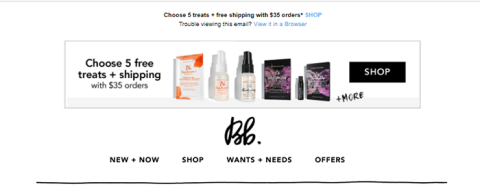
The simplicity of the “Shop” CTA button above allows enough space to fit the offer and images without making the banner look crowded.
2. "Get the App" CTA’s Rely on Persuasive Content
When your CTA and accompanying graphic is as common as “Get the App,” you have to work harder to make it persuasive. Pair great copywriting skills with a fabulous discount to get noticed by your readers.
For example, this Google Express App email opens with top-notch copywriting in a headline that puts the user benefits front and center – “Easy just got easier.” The product details are kept to a minimum so their discount offer can take the spotlight.
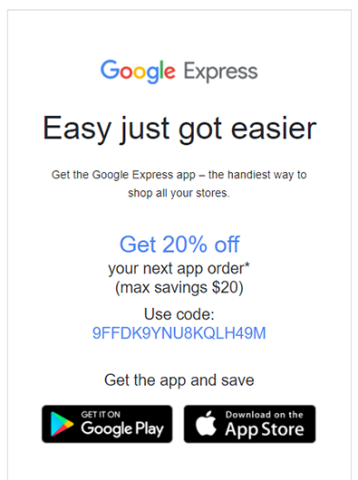
When your CTA must use generic text or graphics, pump up your click-through rates with professional copywriting and a clear offer that’s hard to pass up.
3. "Shop Now" CTA’s Pair Well with Holiday Themes
Well-written CTA’s often pair an action verb with an urgency adverb to inspire user action.
For example, the phrase “Shop Now” includes both a verb (Shop) and an adverb (Now) that inspire a sense of urgency.
But well-written CTAs aren’t enough to compel readers to click within your emails.
Pairing a holiday theme with a “Shop Now” CTA can be an effective way to increase your email’s engagement rates.
Sheet Music Plus’s holiday-themed emails do a good job of encouraging click-throughs because they combine deep discounts with a sense of urgency.
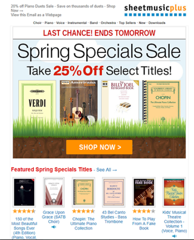
Readers are drawn to holiday-themed promotions because they know the discounts can be big. They also know they need to click now because the offer comes with a limited time frame.
Combining a well-written CTA with a holiday theme is a good way to improve click-through rates for email marketing campaigns.
4. "Read More" CTA’s Work Well With Compelling Content
Links like “Read More” or “Read full article” can be very effective when the surrounding content teases a compelling article.
For example, HubSpot’s blog offers a daily “roundup email” promoting their latest posts.
Their email below includes a headline, image, and starter sentence that “teases” the article. Both the headline and anchor text offer direct links that readers can click on to read the full article.
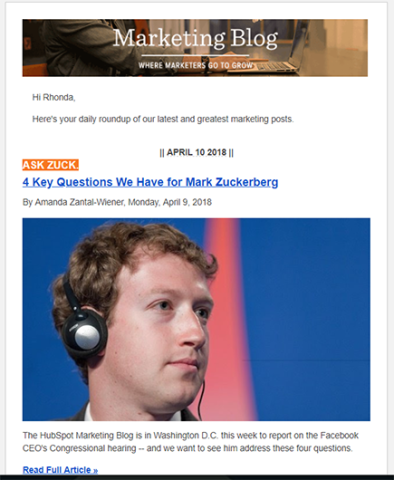
Consider pairing a simple “Read More” style CTA with articles that your readers can’t resist.
5. "Browse Now" CTA’s Can Engage A Variety of Buyer Personas
Encourage readers to browse a selection of your products or content with a “Browse Now” CTA.
Try setting your “Browse Now” CTA into a creative content gallery that inspires your readers to view more. One way to do this is by offering choices that cater to your different buyer personas.
For example, the AirTable email below includes a “Browse the gallery” CTA just below a screenshot of the gallery menu.
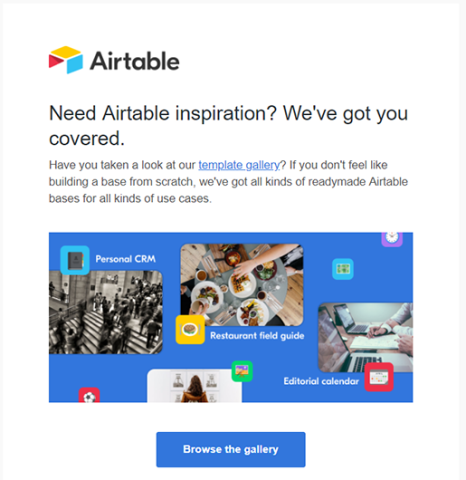
The gallery menu shows a few of the different ways people can use their templates, so it appeals to more than one type of customer.
Try pairing “Browse Now” CTAs with content that sparks interest for each of your buyer personas.
6. Poll Question CTA's Can Catch Readers’ Attention
A CTA doesn’t always have to be a set in a traditional button or text format. Unexpected CTA formats, such as poll questions, can do a great job of catching readers’ attention.
For example, JustFly.com starts off the following email with a chance to win a $1000 in travel credit by answering a poll question.
The headline begins “Vote for a chance to win…” and the CTA buttons are multiple choice answers to the question “What is your dream vacation?”
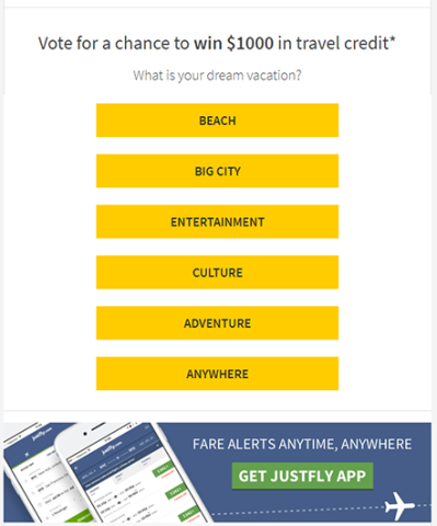
Not only does the email compel users to click, but it also offers useful data about what type of product the person is most likely to consider buying.
Pair poll-type CTA’s with a prize encouraging users to click-through. You then collect data that helps you personalize future emails.
7. "Come Back" CTA’s Bring Back Former Customers
The “Come Back” CTA encourages former customers to re-subscribe to your service.
When you’re trying to connect with leads who’ve lost interest in your product, you’ve got to step up your game in order to grab their attention. “Come Back” CTA’s need to exist inside content that’s irresistible.
HelloFresh, the meal service, pulls it off with an attention-grabbing 50%-off discount surrounded by stunning graphics that leave the reader craving his next meal.
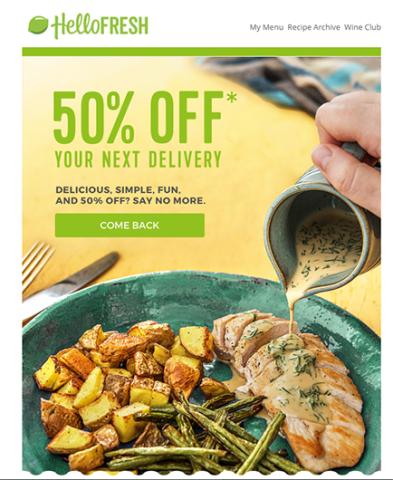
When using the “Come Back” CTA, include an irresistible offer with graphics that remind readers of your product’s benefits.
8. "Try it Again" CTA’s Engage Free Trial Customers That Didn’t Purchase
The “Try it Again” CTA can be written as “Subscribe Now” or “Try it Again.”
Its purpose is to offer another chance to leads who enjoyed a free trial or product samples, but who never ended up purchasing from you. It can also be used to pique the interest of former customers.
Pair this type of CTA with a reason to read and an excuse to try your product again.
For example, the Buzzsumo email below is a great example of how to write a “Try it Again” CTA. It works because it:
- Announces their partnership with Reddit.
- Uses “Subscribe Now” text instead of “Buy Now.” This focuses the reader’s attention away from price as they’re reconsidering the benefits.
- Offers a few more free trial days.
The email leads with benefits and a brief announcement before introducing the “Subscribe Now” CTA button.
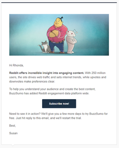
Combining a “Try it Again” CTA with a company update and free offer can be a persuasive way to convince readers to come back and give your service another try.
Good CTA’s Versus Bad CTA’s
The difference between a good CTA and a bad CTA in email marketing depends on the content that surrounds it and the context you present it in.
Keep your calls to action simple and direct, place them above the fold if possible, and don’t be afraid to test and experiment with a new approach.
Try some of the ideas and examples above to engage your inbound and outbound customers and improve your click-through rates.
