How to Design Your Website to Increase Engagement

How to Design Your Website to Increase Engagement
91% of small businesses plan to upgrade their website in 2018. Here are seven ways to boost on-site engagement and better retain your target audience.
Before a lead converts, they engage repeatedly with your website. As a business owner, your aim is to provide such a rewarding site experience that the visitor is compelled to return. An effective web engagement strategy uses visuals, text, and technical features to increase both the volume and the quality of these on-site interactions.
A recent survey showed that 91% of small businesses plan to upgrade their website in 2018. If you're in this majority, shouldn't you aim for increased engagement?

This post will discuss seven web design tips to improve the on-site engagement of your small business website. These techniques will allow you to generate leads, drive traffic, and retain the attention of your target audience.
- Attract with quality design
- Tell a story
- Offer a search bar
- Be mobile responsive
- Speed up your website
- Encourage sign-ups
- Display related content
1. Attract with Quality Design
The more visually appealing your site is, the more users will want to engage with it. At first glance, does your site appear organized? Symmetrical? Aesthetically pleasing?
If so, users will feel compelled to investigate. However, 38% of people will stop engaging with a website if the layout or content is unattractive, according to Adobe. The purpose of your website should be obvious, it’s structure must be logical, and the content should be easy to consume.
Website usability is largely a function of page layout. Apply these four design tips to help you design your most engaging web pages:
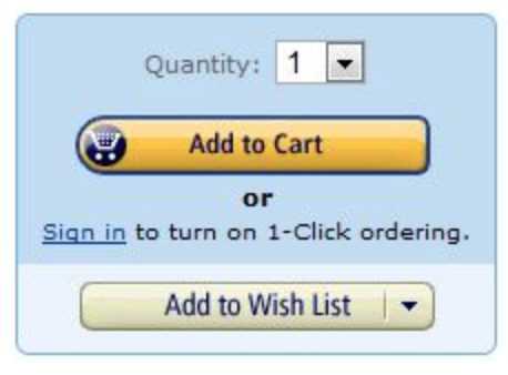
- Establish a visual hierarchy: Visual hierarchy is what signals the relative importance of page elements to users. The eye is drawn to larger and bolder page elements.
For example, we know from its appearance that the topmost button on the Amazon site is the primary option.
- Add white space: White space separates each page element, making it easier to move between ideas. Page clutter leads to visual fatigue because it's difficult to know where one idea ends and another begins.
- Visual focus: Images draw people into a page. Use visual elements to complement your text and enhance the impact of your messaging.
2. Tell a Story
Visual storytelling lets you turn your website into an emotive experience. While other brands limit themselves to discussing features and benefits, you can cut through the noise to engage your audience with memorable interactions.
Storytelling on your site will require a blend of:
- Images: Avoid stock photos and use images that portray your business authentically.
- Video: As online video becomes standard, many users prefer to watch a video instead of reading. Welcome videos are a great way to introduce your brand to newcomers, while explainer videos can offer more details on your product or service.
- Graphics: Charts, graphs, and data visualizations are key for supporting your value proposition and demonstrating your credibility. In fact, Nielsen Norman found that infographics are liked and shared 3x more than any other content.
- Text: Your words should guide users through the site and compliment your visual storytelling. Keywords are necessary for the headers and subheaders, as they signal the relevance of your web content.
3. Offer a Search Bar
Many web visitors are looking for something specific. Engage these people by helping them find what they need quickly. If these users are confused by your site navigation, they’ll bounce.
Place the search bar where people expect it to be. As this example from MailChimp shows, the page header is the most natural place for site navigation.
The search icon sits at the top-right of the page. The blue CTA button even helps draw the eyes towards that corner. Adding features such as a drop-down menu or auto-suggest can enhance your site's search experience.
Learn 5 web design tips for beginners.
4. Be Mobile Responsive
The mobile experience of your site is equally important to the desktop experience. According to Statista, 51.2% of global internet traffic happens on a mobile device.
Brands with a subpar mobile experience will see engagement dwindle and their SEO rank diminish. Users won’t return if they have to pinch and zoom, battle with overlapping page elements, and endure huge blocks of text. Likewise, search engines are penalizing sites that aren’t mobile-friendly.
A mobile responsive design cuts away the frustrating elements that degrade the user experience. Here are some tips for making your site mobile responsive:
- Adjust button sizes to be legible and actionable on smaller devices
- Minimize text with bullets to highlight the user-benefits
- Simplify the page design by increasing white space
- Offer navigation on all pages to streamline access to key content
- Use minimalistic images
The Mobile-Friendly Test from Google lets you see the mobile responsiveness of your site.
5. Speed Up Your Website
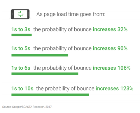
If your page load speed is slower than competitors, you can expect engagement to suffer.
According to Think with Google, 53% of people will leave a mobile page if it takes more than three seconds to load. Similarly, 47% of people expect a desktop page to load in two seconds or less. The graphic below shows how bounce rates increase as page-load speed declines.
You can increase the speed of your website in a variety of ways:
- Compress images
- Enable browser caching
- Reduce the number of plugins
- Minimize HTTP requests
- Reduce server response time
Tools like Pingdom help you test your page load speed.
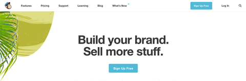
6. Encourage Sign-Ups
Engagement is only relevant if it leads to the next step. An enticing call to action (CTA) will both engage users and further the customer journey.
Pepper your site with multiple conversion opportunities. Each page, however, should have only one main CTA.
Pop-ups let you capture emails as users first arrive or finish consuming your content, though you should use them cautiously - too many can drive users away.
You can also embed links leading to gated content, which then asks for contact information to access.
In the following example, marketer Ezra Firestone puts an email capture box in the page footer to ensure that users can always convert.

This CTA is effective because it outlines the benefits of the email signup to the reader.
7. Display Related Content
To prolong on-site engagement, place related posts at the bottom of each page. This lets users continue reading about their initial subject or jump to a related topic.
For example, this free guide from HubSpot is the perfect segue from a blog about creating a professional biography.
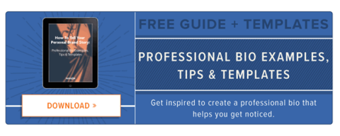
This next-level resource picks up where the blog finished, offering the actionable tips needed to fulfill the theory.
Increasing Engagement with Website Design
When designing your website, aim to reward your visitors with a fluid and intuitive experience.
If users can easily see your website's value, engagement will follow.

Ian Heinig
Writer, Clutch
Ian Heinig is a copywriter who loves big ideas, brand strategy, and psychology. Most days he's drafting new ways to share value, but he's also an illustrator, yogi, and freelance burrito analyst. Find him at radicalartsdepartment.com.