6 Steps for Avoiding Online Form Abandonment

6 Steps for Avoiding Online Form Abandonment
Businesses rely on online forms to achieve key website conversions, but over 80% of people have abandoned at least one online form recently. By making small changes to their online forms, businesses can improve their conversion rates while delivering a better user experience.
Most businesses require website visitors to complete an online form to opt into email communication, receive a white paper, or complete a purchase.
But, no matter how compelling a business’ offer might be, it can be difficult to ensure that people who begin to fill out online forms ultimately complete them and convert.
When people encounter a frustrating online form, such as one that’s too time consuming or disorganized, they are likely to abandon the process entirely.
The Manifest surveyed 502 people to learn why they abandon online forms.
Businesses can use this data to evaluate and improve their online forms to win more sales, sign-ups, or other conversions they may be targeting.
Our Findings
- The majority of people (81%) have abandoned an online form after beginning to fill it out.
- Security concerns are the top deterrent preventing users from completing online forms, with 29% opting for abandonment.
- Form length is the second reason for online form abandonment: More than a quarter (27%) of users abandon an online form because it is too long.
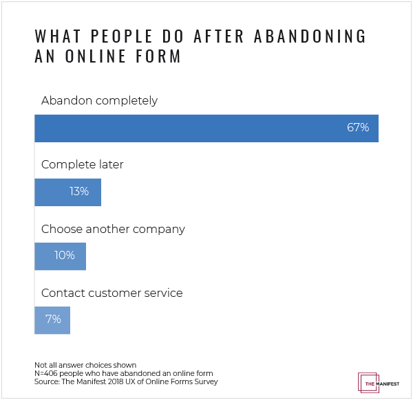
- If someone abandons an online form, they are unlikely to return. More than half (67%) of users opt to abandon the process entirely if complications arise, compared to only 20% who follow up with the company in some way.
- When people return to complete an online form, it’s mostly for self-motivated reasons such as needing access to a resource (30%) or wanting to redeem an incentive (20%).
- Another 19% return to complete an online form if the company initiates additional contact through an email or phone call.
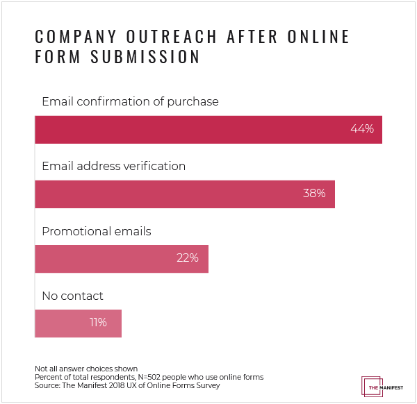
- After completing an online form, companies are most likely to send a receipt (44%), email verification (38%), and/or promotional emails (22%).
- Only 3% of people prefer to fill out online forms on a mobile device, compared to 84% who prefer a laptop or desktop computer and 13% who prefer a physical copy.
Most People Have Abandoned at Least One Online Form
Online form abandonment is a common experience. The majority (81%) of people have abandoned at least one online form, with over half (59%) indicating that they have done so within the last month.

Stu Collett isn’t surprised by these findings. As a Founding Partner and Principal Design Director at Super User Studio, a London-based digital product and service design consultancy, Collett observes people as they interact with websites. He notices that online forms spark universal frustration.
“As humans, we all hate filling out forms,” said Collett. Like many user experience (UX) experts, he describes customer pain points as ‘friction.’ “I think forms are friction,” he explained.
Halfway across the world in Seattle, Kelly Franznick serves as Chief Experience Officer at Blink, a Seattle-based UX consultancy. He agrees that striking a balance between collecting information through online forms and providing a top-notch user experience can be complicated.
“Forms historically have been the necessary evil,” said Franznick. “It’s just something you have to do to accomplish tasks.”
Despite the challenges online forms present, both Franznick and Collett are optimistic about companies’ opportunities to design online forms with less friction.
Desktop or Laptop Computers Are Preferred Mediums for Completing Online Forms
Despite the friction that online forms create, nearly all people surveyed (84%) said they still prefer to fill out forms online.
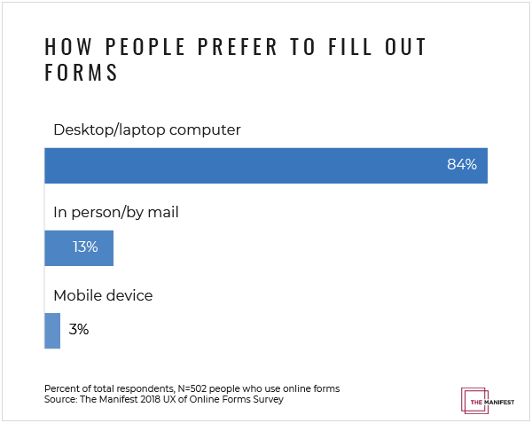
Surprisingly, more people (13%) indicate that they prefer to fill out a physical form in person or by mail compared to only 3% who indicate that they prefer filling out forms on a smartphone or mobile device.
Ian Everdell is the creator of Bad Forms, a blog where he used to publish examples of poorly constructed online forms, plus tips for how to improve them.
“Webforms are actually relatively easy to do relatively well,” said Everdell. “But the flip side of that is it’s really easy to make them really hard.”
To help readers avoid making online forms “really hard,” Everdell uses humor to educate his audience and make online forms feel more approachable.
Everdell’s advice comes from his academic background in neuroscience, as well as nearly a decade of studying eye tracking, a form of usability research that involves tracking and measuring eye movements as people interact with materials online.
Sometimes, people who are unable to complete an online form get embarrassed about feeling confused or uncertain. However, Everdell helps readers understand that poor design choices can have a significant impact.
“Your regular, everyday user doesn’t understand that when they have a problem, it’s not usually their problem,” said Everdell. “The problem is because of a decision that was made when the website was built or when a form was designed.”
For example, Everdell notices that many users become frustrated or confused when an online form summons the wrong keyboard.
In practice, this occurs when an online form requesting a phone number pulls up an alphabetical keyboard instead of a numeric keyboard, which requires users to take extra steps to enter their information.
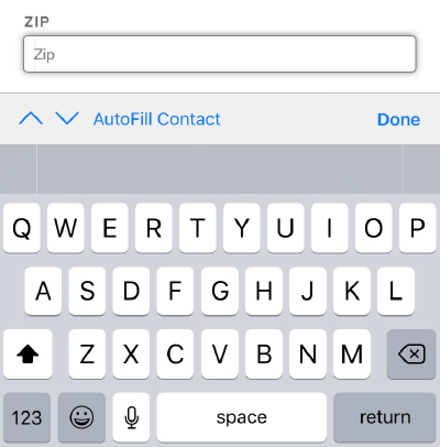
In this example, an online form summons the alphabetic keyboard despite the fact that zip codes only contain numeric characters in the US.
Fortunately, businesses can easily avoid this pitfall. The solution is a simple fix requiring a handful of characters of code.
By making small changes to your online forms, you can surprise people with your attention to detail and deliver a relatively frictionless experience.
People Who Abandon Online Forms Are Not Likely to Return
When people encounter an online form that is frustrating, time consuming, or otherwise difficult, our data shows that they are unlikely to give it a second chance.
When people abandon an online form, more than half the time (67%) they abandon the process entirely.
Beyond limiting conversions, online form abandonment can signal the lost possibility of a future relationship with a customer.
“I think it’s more than just losing the conversion,” said Collett. “It’s [someone] losing connection with your brand.”
Lost connections don’t have to be permanent to have a negative impact. For 13% of online form users, a frustrating experience may lead to procrastination, but they will return to complete the form at a later time.
This is especially true if they cannot accomplish a task another way or if they need to obtain specific information to complete the online form.
However, even if people are forced to return to your online form, you want to avoid giving them a negative impression of your business.
Improving your company’s online forms can lead to stronger customer relationships and a more positive image for your brand.
Top 4 Reasons Why People Abandon Online Forms
People abandon online forms for 4 key reasons:
- Security concerns: 29%
- Form was too long: 27%
- Advertisements or upselling: 11%
- Unclear reason for collecting information: 10%
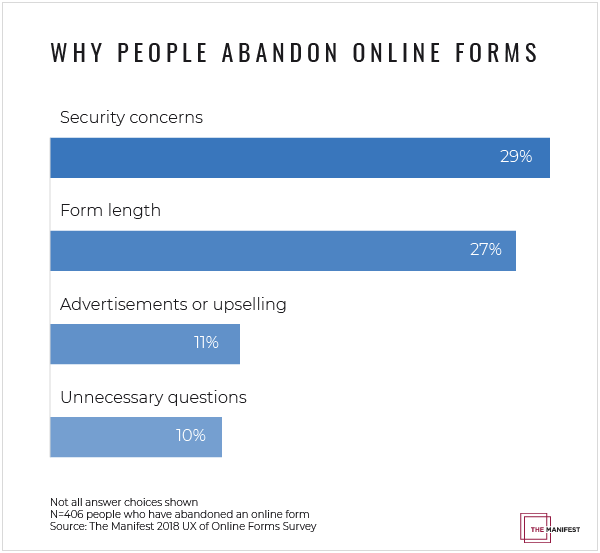
By identifying why people abandon online forms, we learned the improvements small businesses can make to increase their online form conversions.
How to Increase Online Form Conversions in 6 Steps
There are a number of steps your business can take to improve online form conversions:
- Reassure people that their data is secure
- Create shorter online forms
- Avoid advertisements or upselling in your online forms
- Test online forms to identify pain points and solutions
- Remind people to complete the online form
- View online forms as a customer service opportunity
Step 1: Reassure People That Their Data Is Secure
The first step to improving your online form is being transparent about why you’re collecting people’s information, and how you plan to keep it secure once it’s submitted.
There are 4 key steps to improve your website's security:
- Add an HTTPS certificate
- Use encryption to store user information
- Familiarize yourself with GDPR
- Send email verification links
Improving website security is important because security concerns are the leading reason for online form abandonment, dissuading nearly a third (29%) of users.
To start, make sure that your website has an HTTPS (Hypertext Transfer Protocol Secure) certificate. If not, users who access your website through a Google Chrome browser will receive a warning that your website may not be secure.
To add an HTTPS certificate, contact the developer who built your website or consider hiring a freelancer or consultant. If your website is built on website builder software such as Squarespace or Shopify, you should already have an HTTPS certificate.
Once you collect users’ information through your online form, ensure that it is stored securely, preferably using encryption. If you use a leading web form builder such as Jotform, Form Assembly, or Formstack, you can easily enable encryption in the settings.
Additionally, your business may be subject to the new General Data Protection Regulation (GDPR) that the EU recently put into practice. This law outlines basic protections consumers should expect when it comes to how companies treat their data, and it includes compliance regulations for companies outside the EU.
Consider using email verification links to ensure that your users have the opportunity to confirm their authenticity. More than a third (38%) of the people we surveyed report receiving verification emails.

Ultimately, you should want your company to have a reputation for protecting customers’ personal information.
“You can either have integrity or not have integrity,” said Collett.
Securing your online forms can become one additional way to communicate your company’s integrity to your customers.
Step 2: Create Shorter Online Forms
Shorter online forms are more likely to keep website visitors engaged, so consider simplifying your online form as much as possible.
More than a quarter (27%) of people are likely to abandon an online form they feel is too long.
“Simplify until it hurts,” advises Franznick. “What can you eliminate? Get that out of the form.”
By reducing the number of questions in your online form, you can automatically begin to cut down the time it takes to complete.
As a UX designer at Bangalore’s Lollypop Design Studio, Aman Jain helps clients manage the complexity of designing online forms that will be used by an audience that speaks different languages and has different expectations.
Jain’s goal is to design online forms that anyone can use, rather than expecting users to adapt to any particular form design.
“If people are struggling, that means thought was not given while designing that form,” said Jain, who recently authored a guide to designing better online forms.
In online form design, success should be measured by how intuitive a form is for users.
As online form designers consider the range of experiences and expectations users will bring to their forms, Jain encourages them to strive for simplicity.
“If you’re preparing a questionnaire or designing an online form, you have to understand that layout and the language has to be extremely simple,” said Jain. “If you are putting illustrations somewhere, it has to be to the point.”
For example, California Sunday magazine offers free subscriptions to public libraries in California. Their online form requires only the essential information--in this case, a mailing address.
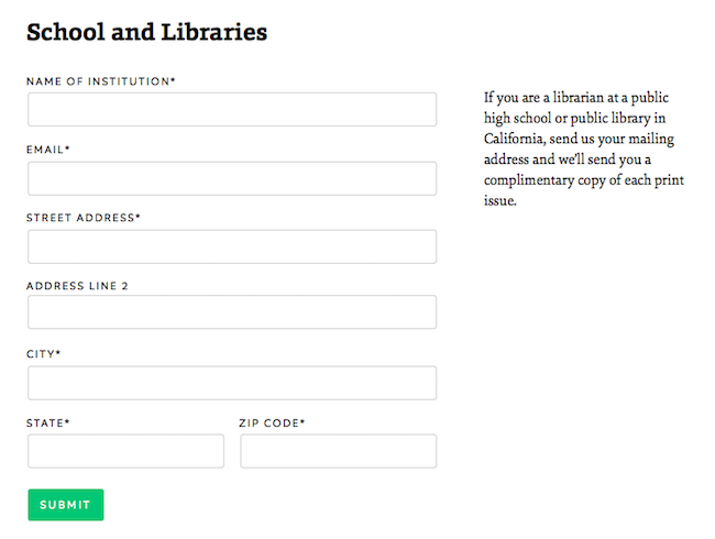
Like California Sunday, all businesses should strive for simplicity to avoid alienating users who might be facing a language barrier, distractions, or other challenges.
Everdell points out that frustrated users are less likely to provide thoughtful, accurate answers.
“If you’re asking too much or for stuff that’s irrelevant, then you’re going to get data that’s equally useless to you,” he said.
Our data supports Everdell’s point: 10% of people will abandon an online form if it’s unclear why information is being collected.
To ensure that questions stay focused, Everdell recommends small business owners complete a “question protocol” in which they evaluate the purpose behind each question field on an online form.
Use the following questions to audit your online forms:
- What information am I asking for?
- Why do I need this information?
- How will this information help me serve the customer?
- What format will I need this data to be in?
Once you’ve identified the information you truly need to collect, you can organize questions into conceptual groupings, such as payment information or contact information, to make the form scannable.
Learn 5 tips for designing the perfect web form.
Step 3: Avoid Advertisements or Upselling in Your Online Forms
If you’ve worked a retail or sales job in the past, you know that a key way to drive business is to suggest add-on purchases to customers who have already shown interest in your products. However, this advice does not translate effectively into online forms.
More than 1 in 10 (11%) of people are likely to abandon an online form that contains advertisements or upselling.
When someone commits to making an online purchase or obtaining a resource online by completing your online form, you want to eliminate obstacles that could stand in the way of completing the online form.
Eliminate any obstacles that could stand in the way of completing the online form.
Additional advertisements about products automatically slow users down by requiring more decisions. They can also come across as self-promotional or spammy.
Instead, you can experiment with adding a one-click add-on once a purchase has been completed.
For example, some airlines give you the opportunity to upgrade your seat with one-click after a ticket purchase has been finalized, or some cosmetics companies will offer an inexpensive travel-sized version of a product you just purchased without requiring you to go through checkout a second time.
Waiting until a user has already completed your online form will ensure that upselling won’t compete for their attention and risk disrupting the conversion.
Step 4: Test Online Forms to Identify Pain Points and Solutions
Observing the way people interact with your online form can help you identify and fix pain points.
Too often, small business owners assume online forms that make sense to them will also make sense to their audiences.
But after spending hours designing an online form, how do you know if your audience will actually find your online form as simple as you hope?
The answer is to test it rigorously.
“Get your audience in there and have them test it out,” said Franznick. “That can be done on the cheap and you can still get great feedback, or you can do it more formally in a usability lab.”
If you don’t have the budget to invest in a usability lab, consider using tools such as Hotjar to begin diagnosing online form problems.
These tools allow you to see how users mouse over your online form.
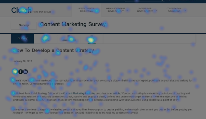
Noticing where users’ attention is drawn can help you uncover hidden patterns that will help you redesign or restructure your online form, reducing friction.
Step 5: Remind People to Complete the Online Form
Despite the relatively low likelihood that someone who has abandoned an online form will return, there is still opportunity to win conversions.
Our survey found that people are willing to return after abandoning a form for self-motivated reasons half (50%) of the time, while 19% will return to an online form if a company initiates contact.
In other words, there is still an opportunity to win online form conversions 19% of the time.

However, more than 1 in 10 (11%) received no contact from a company after filling out an online form. This is a missed opportunity, as some people will convert if prompted.

In fact, over 1 in 10 (12%) of people are willing to complete an online form after receiving an email reminder, while an additional 7% are willing if the company called to remind them over the phone.
To capitalize on this pattern, make sure that your online form’s first question captures people’s contact information. Even if they don’t complete the online form, you can use their contact information to reach out and potentially win them back.
Additionally, you can use your email strategy to strengthen your relationship with customers who complete your online form.
Nearly half (44%) of those surveyed report that they typically receive an immediate email confirmation of a purchase. A prompt confirmation email can help build trust by showing that your company has received their information.
Similarly, more than 1 in 5 (21%) people receive a copy of their responses.
Overall, capturing contact information early in your online form can give you the opportunity to reach out to people who abandon your online form and potentially forge a relationship that leads to conversions.
Step 6: View Online Forms as a Customer Service Opportunity
By investing in designing and testing a simple, effective online form, you are ultimately investing in your company’s customer service.
For 7% of people who have abandoned an online form, the next step is to try to complete the process another way. These people typically try reaching out through existing customer service channels such as email or phone.
The number goes up for people who are filling out event registration online forms: More than 1 in 10 (13%) will try to complete the process through customer service.
Collett believes that when people encounter a frustrating online form, attentive customer service can be a saving grace.
“Instead of turning people away and saying they’re not allowed, you start adapting your customer service to help people,” he said.
One way to help people who are at risk of abandoning an online form is to expand the number of ways you accept users’ information.
For example, if you find that your audience prefers to make direct contact with a customer service representative, you can train your staff to ask incoming callers about the information that the online form would otherwise collect.
Being too rigid and insisting on redirecting people back to your online form can cause unnecessary frustration, especially when information can be collected in multiple ways for the same results.
Investing in Online Form Improvements Should Be a Priority for Businesses
In general, people want to fill out secure online forms that are short and focused. Businesses that avoid including extraneous questions, advertising, or upselling tend to achieve higher conversion rates.
To improve online forms, businesses should rigorously test changes with their audiences. With time, gradually testing a series of variables can reveal audience preferences and drive more conversions.
In the event that someone abandons an online form, businesses should conduct outreach by email or phone to win back the conversion.
By viewing online forms as an extension of customer service, businesses can ensure that their online forms align with their overall values and provide a consistent experience for users.
About the Survey
The Manifest surveyed 502 people who filled out an online form within the past month. The majority (67%) filled out an online form within the past week.
The survey included both male (38%) and female (62%) respondents. All age groups were represented: 10% were 18 to 34 years old, 24% were 35 to 54 years old, and 56% were 55 years or older.
All respondents were based in the United States and came from all regions, including the south (29%), midwest (29%), northeast (19%), and west (12%).
