10 Tips to Enhance the Usability of Your Web Forms

10 Tips to Enhance the Usability of Your Web Forms
86% of people fill out on web form per week. Here are 10 tips to improve your user experience and boost the conversions for your web forms.
Usability is the extent to which users can achieve specific goals with efficiency, efficacy, and satisfaction in a given environment.
What does the usability of a web form say about your business?
If the form is easy to use, you’re making a positive statement. A badly designed web form reflects poorly on your business, though.
According to Mark Baldino, co-founder of Chicago’s UX firm, Fuzzy Math: “[A poorly designed web form] says to this potential customer that you don’t understand technology and you care a little bit less about them. It tells a story of the company’s attention to detail.”
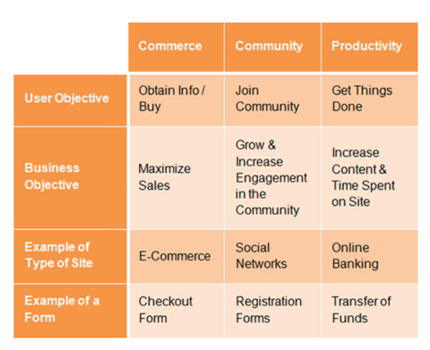
Web forms should allow users to accomplish one of three things with ease and efficiency:
- Join a community
- Obtain information or buy products
- Get things done
If a web form is fluid, the user experience (UX) improves and conversion rates will increase.
In our last article, we covered the core principles of web form design.
Here are 10 ways to enhance the usability of your web forms. Apply them to create a frictionless user experience that’s optimized for conversions.
- Minimize the number of fields
- Arrange fields in single-column layout
- Group related information
- Mitigate errors with inline validation
- Use input masks
- Provide visual feedback
- Avoid placeholder text
- Limit typing with autocompletion
- Match text field to expected input
- Differentiate primary from secondary actions
1. Minimize the Number of Form Fields
The fewer the form fields, the less effort required by the user. The less effort required, the greater the usability and the more conversions you’ll enjoy.
However, if a web form feels lengthy, data input with feel like a chore for users.
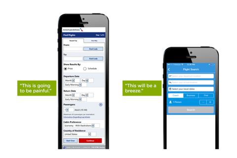
Try to balance the need for data collection with your audience’s limited patience and energy. After all, no one likes filling out forms.
2. Arrange Fields in Single-Column Layout
Users like web forms that flow directly downward.
According to recent research from B2B review site Clutch, 91% of users prefer scrolling through a web form rather than clicking through to various groups of questions.
Multiple columns interrupt this vertical momentum, forcing users to scan in a Z-pattern that slows completion.
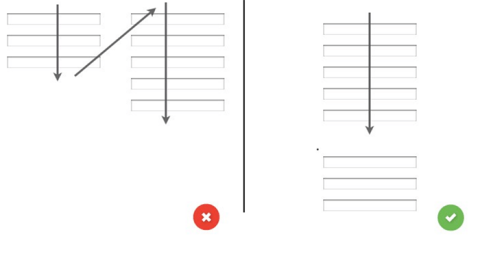
With a single column web form, the path to success is a simple straight line.
3. Group Related Information
Grouping form fields will help the user make sense of the information quickly. Since users think in batches, the form will take less time if arranged logically.
In the example below, the input fields at right are sectioned together in order to create a sense of cohesion.
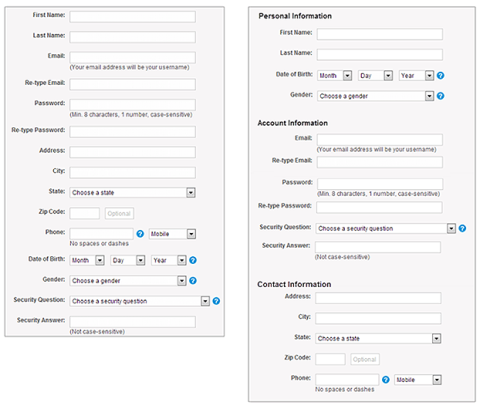
When users recognize the order in the progression, filling out the form feels like a conversation. Creating a sense of dialogue helps improve the UX and encourages data submission.
4. Mitigate Errors with Inline Validation
Though user errors are inevitable, user frustrations don’t need to be.
Inline validation helps improve recovery from errors by highlighting the mistake in real-time and providing a reason.
This works to minimize the annoyance users feel after completing a form and discovering there are multiple errors to correct.
Research confirms that 90% of people prefer web forms that use features such as inline validation, progress bars, and password strength checkers.
Inline validation is effective in assisting those who are creating a username or password, as Twitter shows us here.

However, avoid using inline validation that’s active during keystrokes, as this can complicate data input. If users are being told there’s an error before completion, it will only frustrate.
5. Use Input Masks
Input masks are a formatting technique that helps users focus on required data. In the example below, you can see that parentheses, backslashes, and dashes are presented within the form fields.
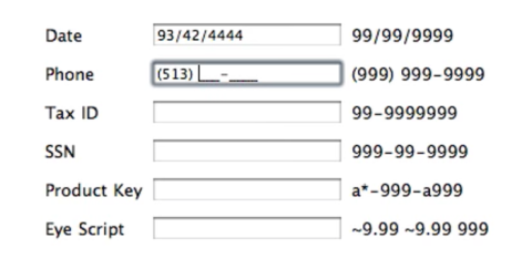
These placeholders appear automatically as the numbers are entered to guide data input. This simple technique saves time and effort with credit cards, phone numbers, etc.
6. Provide Visual Feedback
Design your call to action (CTA) button to indicate that the form is processing after being clicked.
This provides much-appreciated feedback to users that will minimize confusion and prevent repeat submissions.
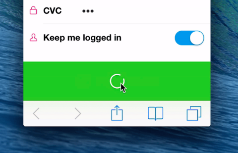
Visual cues allow users to understand that the web form is accepting their information properly.
7. Avoid Placeholder Text (Inline Labels)
Though placeholder text eliminates visual clutter, it’s potentially confusing to users. Since the label disappears once the field is in focus, people may mistake placeholder text for a completed area or forget what’s required.
One exception is the floating label, seen below.
Floating labels function as placeholder text but then reappear above the input field after the first keystroke, avoiding all usability issues.
8. Limit Typing with Autocompletion
Anything that reduces typing requirements will improve user experience – especially on mobile. Autocompletion improves usability by cutting down on keystrokes and the opportunity for error.
For example, the Place Autocomplete Address Form from Google reduces time spent typing with geo-location and address filling.
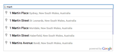
Cut down on the time users spend filling out your web form, and your conversions will increase.
9. Match Text Fields to Expected Input
The length of the input field should correspond to the desired answer.
For example, if you are simply asking for a user’s zip code, do not make the text field long enough for a sentence.
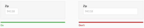
Use this tip for fields where the response length is fixed, such as zip codes, credit cards, phone numbers, etc. This will help streamline your web form for a more intuitive user experience.
10. Differentiate Primary from Secondary Actions
Adding visual distinction between primary and secondary action buttons helps to encourage completion.
If buttons appear too similar, users may become confused and make errors, which can result in failure.
In the example below, we see how distinguishing buttons by color and style helps to encourage a successful outcome.
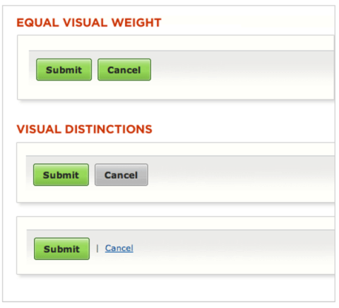
When the visual weight is offset, the risk of misclicks and frustrations is significantly lowered.
Web Form Usability
A fluid user experience is the crux of usability best practices.
From first input to final CTA, your web forms should be completed effortlessly.
Presenting users with a linear web form allows you a direct line to optimized conversion rates.

Ian Heinig
Writer, Clutch
Ian Heinig is a copywriter who loves big ideas, brand strategy, and psychology. Most days he's drafting new ways to share value, but he's also an illustrator, yogi, and freelance burrito analyst. Find him at radicalartsdepartment.com.