5 Best Practices for Website UX

5 Best Practices for Website UX
Nearly 40% of people will leave a website if the content or layout is unattractive. Here are 5 best practices that work to enhance your website's user experience and increase conversions.
What good is a beautiful website if it’s confusing and impractical?
Focusing on the key elements of website design will help you create an easy-to-use website. How you integrate these elements of website design contributes to your website’s user experience (UX).
User experience encompasses every aspect of the user's interaction with a company and it’s products and services, according to Nielsen Norman.
The objective of a website’s UX design is to create a welcoming and usable platform that helps users get what they need and encourages repeat usage.
Here are five UX best practices for creating a usable website:
- Allow mobile responsiveness
- Motivate with calls to action
- Assist with proper navigation
- Offer help and documentation
- Write for your users
1. Allow Mobile Responsiveness
Time spent on mobile devices now exceeds time spent on desktops by 51% to 42%. This means that users expect websites to look great on all devices.
In fact, a user is 5x more likely to bounce from your website if it's not optimized for mobile, according to Adobe. And since Google changed its algorithm to consider the responsiveness of website design, mobile-unfriendly websites rank lower.
Optimizing for mobile means streamlining the user experience. Trimming the secondary elements of your web pages provides better readability and ease of use.
This is a content-focused approach to web design that prioritizes visual hierarchy. Visual hierarchy is what influences how the eye moves between visual elements given their assigned weight and arrangement on the page. Done well, it creates a fluid web browsing experience.
In the example below, Recurly provides a sparse yet engaging home page with a value proposition and a vivid call to action (CTA) button. This visual hierarchy on the page emphasizes only the most important elements.

With limited real estate on small screens, mobile responsiveness relies on a minimalist approach that emphasizes the essential page elements.
2. Motivate with Calls to Action
Calls to action (CTAs) transform prospects into buyers. If your conversions are low, try tweaking your CTA to improve the conversion rate and overall site experience.
Best practices dictate that CTAs be large, boldly colored, and use active language to drive a response. Your audience may respond better to certain colors, shapes, and wording. Ultimately, these separate elements of the CTA should align with your offer to motivate action.
Below, Zenefits places two identical CTAs on their homepage. The HR software platform succeeds by using benefit-driven copy – “Get Demo” – on a zesty orange button to grab attention.
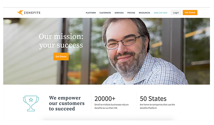
CTAs are most effective when placed near the offer and in areas that promote action. The CTA button should be the actionable cherry on top of your web page.
3. Assist with Proper Navigation
Website navigation can be a huge point of friction for users. Great website UX ensures that users always know what they’re doing and where they are on your site.
To guide users towards success and avoid confusion, use these proven UX design elements:
- Sticky navigation: Sticky navigation is a menu that doesn’t disappear as the user scrolls down the page. This keeps critical site elements nearby at all times, so users don’t have to hunt for the next step and can move easily between site sections.
- Page headers: The header of any page should be designed to look like the navigation items. This reminds users of where they are on the site and reassures them of their progress.
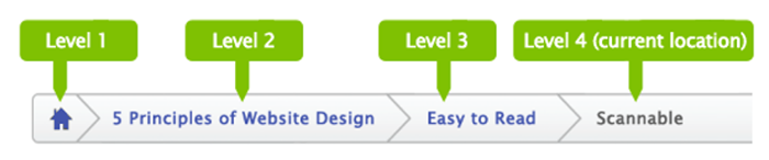
- Breadcrumb navigation: Breadcrumbs are horizontally arranged text links separated by the “>” symbol. Placed in the header, these work to show users their browsing history and permit an easy reversion to past pages. Here’s an example:
- Progress bars: Users love progress indicators because they help them to manage their expectations about time usage. Research from B2B review site Clutch found that 90% of users prefer web forms with progress bars and similar features.
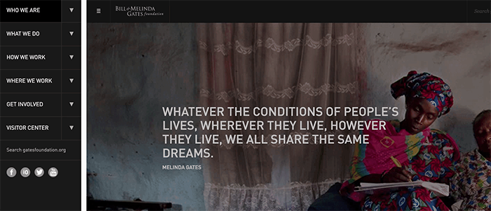
For example, The Bill & Melinda Gates Foundation provides a sticky navigation bar with active icons that remind users how to revert to the previous site area.
The more obvious and interactive the navigation, the better the website UX and the happier the users.
4. Offer Help and Documentation
Even the most straightforward websites should provide help and documentation to guide users throughout the site. This information should be searchable, answer user tasks, and list the steps needed to succeed.
Here are a few practical techniques to improve the UX with user assistance:
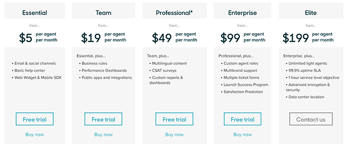
- Pricing tables: If your pricing plans are loaded, a pricing table is a great way to provide an overview of this information. A visual layout should aggregate, detail, and facilitate the exploration of different features.
Below, Zendesk clearly details its pricing tiers to remove any confusion around pricing and features.
- FAQs: A self-help area of your website is an effective way to answer common questions. For high-commitment conversions such as “Sign Up,” it’s beneficial to place an FAQ nearby to encourage completion.
- Live chat pop-ups: The ideal time to answer user doubts is when they arise. Live chat features allow you to interact with users in real-time as they’re searching for answers.
- Microcopy: Microcopy is a small bit of targeted text that’s placed at the point of conversion. Use it to prevent mistakes or alleviate hesitations the user might have at this critical juncture.
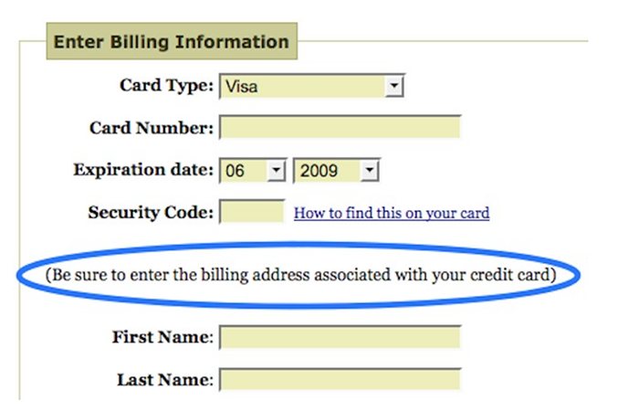
In the example below, an ecommerce site improves their UX with microcopy that reminds users to enter the proper payment information.
Ultimately, the assistance provided should be short, sweet, and promote a fluid user experience.
5. Write for the User
Your website should speak to users in their language. Use words and phrases familiar to your audience and eliminate any jargon.
To discover this language, talk with your users and conduct keyword research. What does your product or service mean to them? How do they describe it? If the website copy sounds like something a user would say, your UX will be intuitive and seamless.
When presenting information on your website, try to answer your users' questions before they arise. Sequencing copy in a natural and logical order will help your site read like a conversation, which users will appreciate.
Slack makes good use of informal language to sell their team collaboration tool.
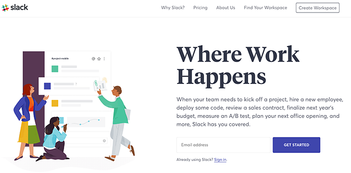
There’s no mention of technical features or buzzwords here.
Instead, the company uses expressions that are commonplace within their customer base. The result is a targeted, personable, and inviting conversion process within an effortless UX.
Website UX Best Practices
The best websites are a joy to use – and it’s no accident.
They’re the result of a focused effort to distill the UX into a collection of positive interactions.
To achieve UX success, carefully eliminate any annoying or misleading website elements.

Ian Heinig
Writer, Clutch
Ian Heinig is a copywriter who loves big ideas, brand strategy, and psychology. Most days he's drafting new ways to share value, but he's also an illustrator, yogi, and freelance burrito analyst. Find him at radicalartsdepartment.com.