5 Tips for Designing the Perfect Web Form

5 Tips for Designing the Perfect Web Form
86% of people fill out at least one web form per week. Here are five ways to design optimized web forms that generate leads and convert customers.
A web form is a gateway. In the online world, it’s often the only thing between your prospect and something they want.
According to recent research from the B2B reviewer Clutch, 86% of people fill out at least one web form per week.
Each of these millions of daily interactions is a step in a customer journey – and an opportunity.
From a content download to final checkout, your business benefits from helping people reach their goals efficiently.
Clear and concise web forms will boost your lead generation efforts, conversion rate, and customer retention. However, they can impede your success if misaligned with users’ needs.
Here are five best practices for designing web forms:
- Include the 5 key elements of a web form
- Make forms easy to use
- Minimize form fields
- Catch attention with your call to action (CTA)
- Design with visual contrast
Follow these steps to create more efficient, more effective, and higher-converting web forms.
1. Include the 5 Key Elements of a Web Form
Effective web forms include five key components:
- Structure: This includes how you order the fields, arrange the form layout, and connect between fields. Ordering the form logically will result in an easy, frictionless user experience (UX) that leads to greater conversions.
- Input fields: These areas ask for user data, such as text fields, password fields, checkboxes, radio buttons, sliders, etc.
- Field labels: These tell the user what’s required from an input field.
- Action buttons: If the user presses the button, an action will occur (i.e. a data submission).
- Feedback: This interaction tells the user the result of their input. It can be affirmative (“Thanks for signing up!”) or corrective (“This entry doesn’t look right” ). This also includes any sort of assistance or entry validation to facilitate the process.
Below, Skype uses each of these elements in their registration form.
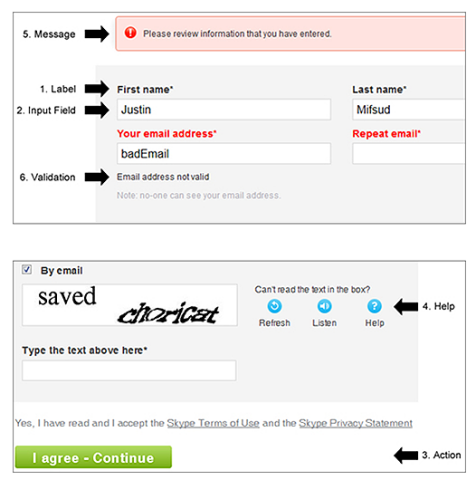
If the web form is well-arranged and includes the necessary elements, it will be both functional and easy to use.
2. Make Your Web Form Easy to Use
The goal of web form design is to show users what’s required, then guide them between the elements until completion.
Be as clear as possible to ensure a frictionless web form experience. You can simplify web forms in numerous ways:
- Use specific labels: Instead of “name,” ask for “first name” and “last name.”
- Use short labels: Help users scan your form by using succinct and descriptive labels.
- Provide examples: If a field may confuse users, offer an example to explain the format. For example, a birthday input field could show “11/30/1986.”
- Use asterisks for required fields: Typically, it’s best to avoid optional fields. However, if you must use them, an asterisk will work to delineate the required from the voluntary.
- Use sentence case: Enhance the readability of your web form by using sentence case – capitalizing only the first word in a sentence – for longer phrases. Title case (“Sign Up Now”) can be functional for CTA buttons.
- Make the form title easy to understand: The title of the web form should tell users what they get after completion, plus the benefits.
For example, Salesforce uses a bulleted list to accompany their web form title – ”Sign up once and watch any of our free demos."

The simpler and more beneficial the web form appears at first glance, the more likely users are to convert.
3. Minimize Form Fields
Less is always more when designing web forms.
Shorter web forms create less friction for users, which improves the chance of a conversion. A study by Hubspot found that cutting the form fields from four to three increased conversions by 25%.
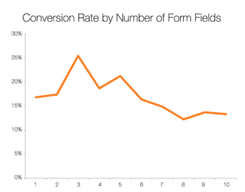
Typically, 5-7 form fields are acceptable to users.
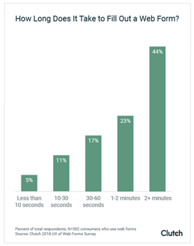
A recent study from Clutch found that the largest percentage of people (44%) spend more than two minutes completing a web form. Of the surveyed respondents, 23% spent between 1-2 minutes when completing a web form.
Avoid overwhelming users by requesting only the data needed to further the customer relationship.
If you need to include more form fields, try spacing them across multiple pages. This will reduce the perception of effort to visitors.
To gauge whether your web forms are overlong, you can look at the bounce rates for your landing page or form-fill page. If your bounce rate is high, consider cutting back on your form fields and A/B testing what works best for your customers.
4. Catch Attention with Your Call to Action (CTA)
The call to action (CTA) button on your web form shows users what’s next. It should both capture the intent of the web form and address the user’s end-benefits.
The button’s text and appearance are both important in finalizing the conversion.
When designing your CTA button, remember to:
- Make the CTA button large and unmistakable on the page.
- Give it a 3D appearance or make it interactive when scrolled over or clicked.
- Contrast the button color to the rest of the page so it pops out.
- Highlight the CTA button with directional cues, such as arrows or pictures of people’s faces.
Think of your CTA button as a springboard. Use descriptive language here to help persuade users to move to the next step.
For example, below we see two CTA buttons – “Sign Up” and “Submit.”
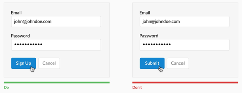
Even with basic CTAs like these, signing up for something is always more enticing than submitting information.
If needed, support the CTA button with additional text underneath. Any time-sensitive (“14-day free trial”) or relevant information (“You’ll receive one newsletter per week”) can be added here.
5. Design with Visual Contrast
Visual contrast is critical to web form design because it indicates which areas deserve attention. Without immediate visual cues, users may become confused and decide to bounce.
After all, it only takes .05 seconds for someone to decide if they want to stay on a page. Your ability to quickly steer visitors towards action will have a huge impact on your conversion rate.
Remember these visual elements when designing your web form:
- Color: using primary and complementary colors together will help your designs stand out.
- Brightness: placing a light object on top of a dark object will make it pop – and vice versa.
- Object limitation: placing your web form in a space free of competing objects will work to catch and hold attention. When the goal is a conversion, it’s best to limit all distractions.
For example, this ebook offer from marketer Greg Korisko uses a different shade of orange for the CTA to help draw the eye downward.
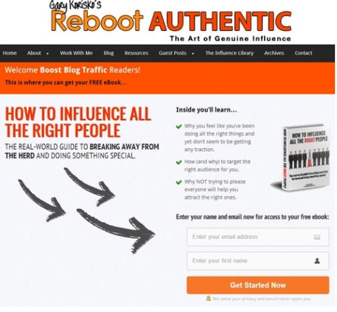
Plenty of white space and arrows also contribute to a welcoming and straightforward web form.
You can optimize your conversion rates by designing simple yet instantly appealing web forms.
Creating Web Forms for Your Business
Like all interactions with prospects and customers, web forms should be fast and frictionless.
Use them properly to quickly usher your audience into the next stage of the customer relationship.

Ian Heinig
Writer, Clutch
Ian Heinig is a copywriter who loves big ideas, brand strategy, and psychology. Most days he's drafting new ways to share value, but he's also an illustrator, yogi, and freelance burrito analyst. Find him at radicalartsdepartment.com.