7 Tips to Design User-Friendly Web Forms

7 Tips to Design User-Friendly Web Forms
Contributed ContentWeb forms are an essential part of any website. Learn how to make your forms user-friendly with these simple tips.
Designing a user-friendly form is tricky.
Whenever visitors want to sign up, make a payment, or subscribe to a newsletter from your website, they need to fill out a form. However, ensuring a form is user-friendly requires an effective strategy.
For example, long forms may cause visitors to leave a website. Short forms come with drawbacks of their own: They offer little business data and are less secure for your users.
Balancing user and site needs when designing forms can be difficult.
Forms must be clean, simple, and functional enough to collect the user information your site needs.
In this article, we’ll reveal the best practices to make your forms user-friendly. These tips apply to all types of websites and come from the experience of designers who have helped craft hundreds of web forms for small business to enterprise-level clients.
1. Keep Field Labels Visible
Surprisingly, many websites don’t label their form fields correctly. To save on space, they’ll leave labels inside fields so that when the user starts typing, it disappears. This may seem like a nice trick, but it’s not user-friendly.
Users filling out forms may involuntarily click on a field before reading the label. Therefore, the label should always be visible in order to remind the user of the field’s function.
A failure to keep field labels visible can result in user confusion:
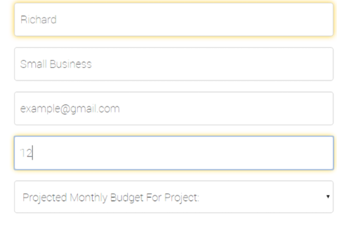
Note that there is no way for the users to find what the field was originally asking of them.
LinkedIn does a better job making the field labels clearly visible:
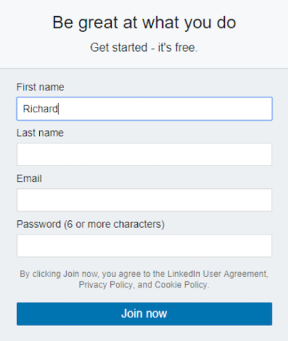
Despite the field labels taking up extra space, this form is substantially more user-friendly.
You can also keep labels inside the fields and have them “whisk out” once a user clicks in. This ensures forms are stylish and usable.
Google employs this design effectively:
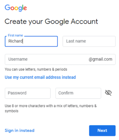
Google keeps its field labels visible at all times, which reduces user confusion.
It’s essential to keep all field labels visible when people fill out your web forms.
2. Make Your Form and Error Messages Informative
In many cases, a form field only accepts specific responses. For example, your website may not accept weak passwords. But users don’t know that in advance.
So, if a user is entering a password that doesn’t fulfill your requirements, avoid providing an error message such as “Password too weak. Try again.”
Instead, your error messages should clearly communicate the problem to the user. “Please use at least 8 characters with a mix of letters, numbers, and symbols” is an excellent example of a user-friendly error message.
It helps if you already mention these requirements adjacent to the field, like in the Google form above. If users take the time to fill out and submit a form, they should not be subjected to a message such as “The username is too short.” The form should specify why the username is too short and include length requirements.
Forms need to be clear what they are asking, and error messages must explain in detail how to fix it.
3. Let Users View Passwords While Typing
Replacing characters with bullets in the password field is a common practice. However, it’s useful to have a “view password” option alongside this field.
That way, if users are facing any difficulty, they can see what they are typing. Omitting the “view password” button can cause user frustration.
4. Enable Social Logins
Being asked to create a new account for every site or e-commerce store someone visits is inconvenient for users. Enabling social logins allows your visitors to skip the hassle of filling out a form.
Of course, some users are likely to have concerns regarding the privacy issues of social logins. As a result, you should also keep the email sign-up option in the form.
The e-commerce site Kogan.com features social sign-up options:
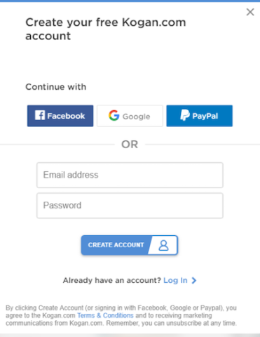
Users can sign up for Kogan with their Facebook, Google, or PayPal, or they can create an account with their email address and password.
Including the ability to login with social accounts helps users when signing in, as they don’t have to remember a password to your site.
5. Effectively Use Radio Buttons, Checkboxes, and Dropdowns
Radio buttons and checkboxes are more user-friendly than dropdowns because selecting an option from a dropdown requires extra clicks.
Use radio buttons when users can select only one option. Use checkboxes when users can select multiple options.
Dropdowns are suitable only when there are more than five options to choose from. For instance, if your form contains a country field, a dropdown menu would be suitable.
WebAlive, a team of Melbourne website designers, correctly aligns its radio and checkboxes vertically in its “Get a Quote” form:
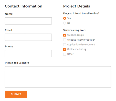
WebAlive uses a combination of radio buttons and checkboxes on its form – radio buttons for single-select questions and checkboxes for multi-select.
Radio buttons and checkboxes are more user-friendly on forms than drop-down menus.
6. Remove or Mark Optional Fields
Ideally, a web form shouldn’t contain optional fields. If you use optional fields, be sure they are clearly marked. Research suggests that it’s always best to mark the optional fields of a form rather than the required ones.
When you set the required fields, most users will only fill in those parts. But if you mark the optional fields, that will prompt the user to fill out the form linearly, without scanning for the required fields.
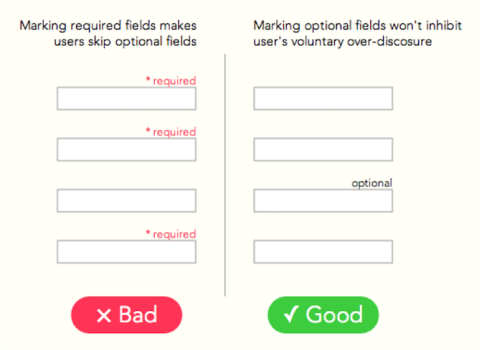
Users are more likely to fill out forms fully if fields are marked optional, rather than required.
7. Avoid Using Older Captchas
Many websites make use of captchas in web forms in order to deter spambots. Although spamming is a serious problem for website owners, using certain captcha in forms can negatively affect your conversion rate.
Research conducted by Stanford University shows that although captchas are designed to be “easy for humans but hard for machines,” it’s often not the case. Captchas are quite challenging, time-consuming, and frustrating for many users, including your potential leads.
However, new captcha systems such as reCaptcha v3 from Google eliminate the need for human verification tasks. reCaptcha v3 uses behavioral analysis to catch bots. For your users, the process is entirely frictionless.
So, if you are using any older captcha system, it’s time for an update.
Create a User-Friendly Web Form
There are many other aspects of user-friendly web forms worth researching, especially if you run an e-commerce website.
The global e-commerce market size will be about $2 trillion in 2019, and online businesses are becoming more competitive. Forms are the key channel through which your potential customers communicate with your business.
Optimizing your web forms is vital for business success.

Amio Chowdhury
Content Writer, WebAlive
Amio Galib Chowdhury is a Content Writer at WebAlive, an Australian web development company. He mostly writes on ecommerce, user experience design and SEO.