11 Tactics to Optimize Your Website’s User Experience

11 Tactics to Optimize Your Website’s User Experience
Nearly 95% of consumers distrust websites with poor design. Get the tactics you need to optimize your website’s user experience and increase engagement, conversions, and revenue.
Updated August 1, 2023
What do ninjas and user experience (UX) design have in common?
They’re both invisible when performing at their best.
UX design is defined as the process of enhancing user satisfaction by improving the accessibility, usability, and efficiency of user interactions on your website.
If your website’s UX is optimized, it provides easy value to users without them ever noticing. According to research, enhancing UX is one of a top priority for small businesses.
Yes, your site should be beautiful, and your content must be outstanding. However, 76% of consumers say that the most important element of web design is being able to find information.
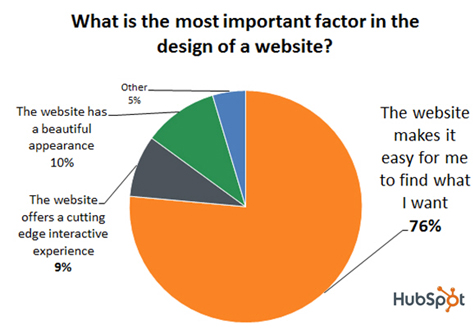
An intuitive and rewarding site experience will attract repeat users. However, if your website creates unnecessary hassles, it will impede your success.
So, how can you help users find your solutions and products more easily during their customer journey?
Here are 11 tactics that will improve your website UX:
- Simplify your design
- Add interactive content
- Choose colors deliberately
- Minimize forms
- Keep animation simple
- Link wisely
- Personalize
- Optimize for mobile devices
- Highlight social proof
- Unclutter the navigation bar
- Avoid 404 errors
In need of a better user experience? Hire a top UX design agency on The Manifest.
1. Simplify Your Design
The best UX designs are clean, orderly, and free from clutter.
Visual simplicity is effective because it’s immediately understood by users. The minimalist approach makes finding information easy, so provide a familiar layout and allow each design element plenty of space.
Since web visitors came for answers, not creativity, avoid complicating your UX design.
For example, the Gifme website creates interest with a bold image and partially hidden text but maintains the ‘less is more’ feel with an uncomplicated layout.
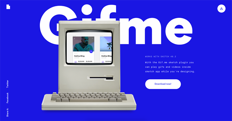
Instantly accessible web design is the easiest way to invite user engagement. Make sure there is a balance of whitespace and visual design to attract potential customers while allowing them to navigate your webpage’s content.
2. Add Interactive Content
The more someone wants to interact with your web interface, the better their experience will be. Using interactive content will make your site design fun and drive engagement.
According to a 2016 survey by Content Marketing Institute, 75% of marketers plan to increase their use of interactive content.
To enhance the desirability of your UX, try adding:
- Videos
- Calculators
- Games
- Quizzes
- Case studies
Simplicity is key, as website visitors should be able to engage with content after a quick glance. Think of what interactive content your target audience will want to see.
3. Choose Colors Deliberately
Color plays an important role in influencing user perceptions and actions on your website. Your choice of palette will set the emotional tone for the entire experience.
In a brilliant use of color psychology, graphic designer Oliver Guilleux uses purple to convey sophistication and intelligence.
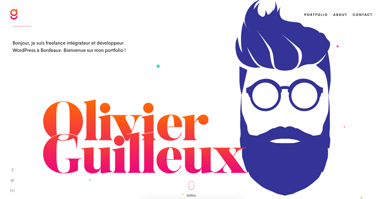
Meanwhile, the pink and orange text communicates energy and confidence, all of which combines into an enticing homepage.
NeuroMarketing said it best: “If a good color sells, the right color sells better.” For example, a Kissmetrics survey found that women prefer purple, men prefer black, and both like blue and green.
If a good color sells, the right color sells better.
To find the ideal color for your calls to action and the overall site design, conduct research, run tests, and use the findings to optimize your website UX.
4. Minimize Forms
While data collection is key to business success, no one enjoys giving out personal details. Asking for unneeded information can annoy users and reduce conversions.
You can improve your UX by removing unnecessary fields from signup form boxes. Streamlining the signup process will reduce user friction and can produce amazing results.
For example, when Expedia omitted the “company name” field from their registration forms, their revenue skyrocketed by $12 million.
Ensure that any forms your company has on landing pages have clear and concise CTAs and follow any usability testing guidelines.
5. Keep Animation Simple
Animations are a trending way to delight web visitors and help them navigate your site. However, motion graphics shouldn’t complicate your UX design, impact page speed, or overwhelm visitors.
Use animations with purpose, such as to:
- Encourage scrolling
- Assist with navigation
- Prompt retention
- Increase conversion rates
- Entertain users during page loads
- Signal progress or a completed action
Below, we see a page-load GIF used by Aviasales to smooth-out the booking process.
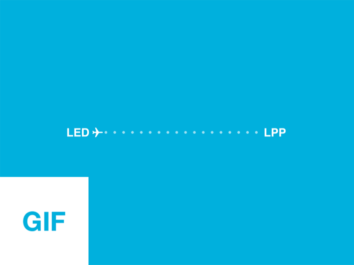
To effectively enhance user attention and comprehension, animations should be simple and action-specific.
6. Link Wisely
Follow SEO best practices when it comes to linking in a website design. Embedding a link in your content invites users to click there (CTAs, anyone?). Consumers follow sections of underlined words and different colored text as visual clues.
For best results given these user expectations, highlight the most engaging idea and be sure to keep the color blue.
7. Personalize
Personalization is important to web design because it makes people feel like the web content was created just for them. If the web experience feels unique, website visitors are more likely to return.
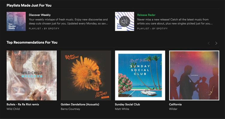
For example, companies like Netflix and Spotify offer content and recommendations based on past purchases and views. These companies curate personas that follow similar patterns in buying and engagement, allowing them to curate high-quality support and recommendations.
When surveyed by the research group Forrester, 77% of consumers claimed to have prioritized, recommended, or paid more for personalized service (Source: Download PDF).
Customizations help visitors feel like part of a community and work to increase engagement, loyalty, and conversions.
8. Optimize for Mobile
As mobile usage continues to climb, a mobile-friendly website is essential to a quality UX.
According to the customer management solution Salesforce, 75% of consumers expect brands to have a consistent cross-channel experience, meaning your mobile device should also have a user-friendly experience.
Your website on a smartphone should fit the screen size, have a well-thought-out user interface, clear content with visible headings and CTAs, and more to meet the needs of mobile users.
You can check the mobile responsiveness of your site with Google’s mobile-friendly test.
Already mobile-ready? A study by Think with Google found that mobile page load times significantly impact conversions and bounce rates. To optimize your mobile UX, use Google’s mobile speed test.
9. Highlight Social Proof
Social proof is a psychological phenomenon where people look to the behavior of others to determine the correct course of action.
For example, placing a positive customer review on your site will demonstrate your trustworthiness to prospects – even if they’re encountering your company for the first time.
What’s more, 79% of consumers trust online reviews as much as personal recommendations. To achieve maximum impact, feature your best testimonials on your homepage (or one or two scrolls down).
Conveying immediate credibility with social proof can make the difference between a bounce and a new lead.
10. Unclutter the Navigation Bar
Located at the top of your home screen, the navigation bar is what connects users to other sections of your website. For best results, avoid crowding your menu with excess choices that can overwhelm users.
Instead, relocate less crucial navigation items to the interior pages. This will create a clear and visible layout that makes site exploration easy.
Set your logo as a link to your homepage, as visitors use this to reorient themselves. Enabling onsite search functionality will help readers find what they need quickly – and assist you in optimizing your content strategy.
11. Avoid 404 Errors
If faced with a 404 error page, visitors may get annoyed and reconsider using your website.
The link was supposed to take them someplace interesting, but instead, their web journey is disrupted.
Checking for broken links with Google Webmaster tools will help you curtail user frustration and defection. To minimize the drawback of future 404s, you can create a humorous message to help get users back on track.
For example, CatsWhoCode has a silly and thematically-appropriate 404 error page.

Covering your bases like this provides an opportunity to share your brand voice, improve UX, and minimize bounce rates.
Your Best Website UX Tactics
While single elements will improve your website UX, combining them effectively is what ultimately creates a quality web experience.
As you optimize your website’s UX, be sure to address the core principles of UX design as well.
If your website is efficient and aligned with your customer’s needs, UX success will follow.
