How a Good Modal UI Design can Increase User Engagement
How a Good Modal UI Design can Increase User Engagement
Imagine a scenario where your website users interact with a page when suddenly, a pop-up covers the entire screen, and they can’t continue navigating! So annoying. Such pop-ups can be intrusive and disruptive to a user experience. This guide will outline how you can employ a robust modal UI design to better appeal to user needs.
If done right, User Experience (UX) and SEO modals are highly invaluable to web admins and they are a great way to interact with users and keep the readers hooked. This guide will expound more on what modals are all about, why it is necessary, when to use it and how to increase user engagement.
What is a UI Modal?
For starters, a modal is an element of a website or an app that shows up in front of a main page/window. When it pops up, it also deactivates actions in the main window (which is now in the background).
Before the user can return to the main page, they need to take an action within the modal. For instance, a user might click a call to action (CTA) button to sign up for an offer or close the modal entirely.
Modals are also called dialog windows, pop-ups, or overlays.
Why are UI Modals Important?
First and foremost, a modal is an excellent way for your brand to communicate with your target user as they interact with your app or site.
The primary reason is that they are good at attracting focus from the user. Modals get more impressions. They are an effective way to relay important information that the reader shouldn't miss. You can also use a modal to request information from a user.
If you are interested in learning more about the same, you can visit Outreach Monks blog “How To Align UX and SEO To Achieve Desired Results?”
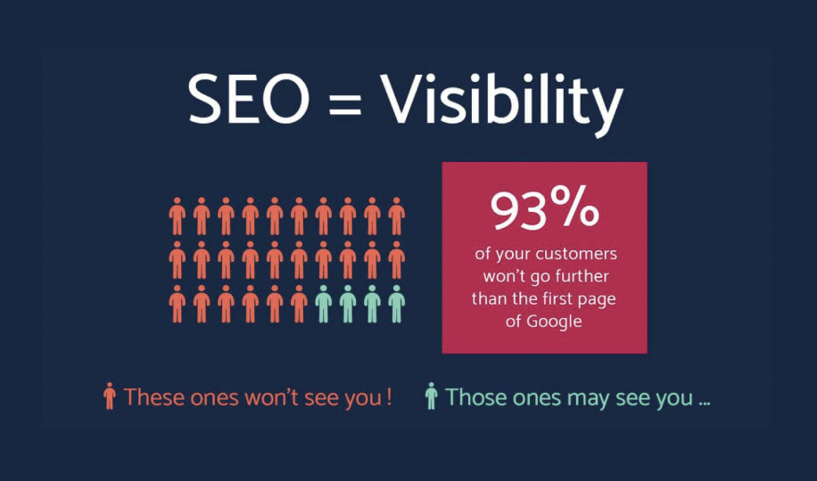
Source: springboard
When to Use a UI Modal
A modal is appropriate for the following scenarios:
- Success and error messages
- Updates on new products and features
- Announcements about new events
- Data collection
- Sign up CTAs
- Onboarding flows
Pro Tip: Be wary of using full-screen modals in your website or apps. You can perhaps use this kind of modal to deliver mission-critical actions.
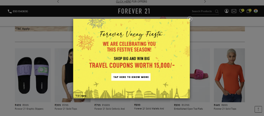
Source: forever21
10 UI Modal Best Practices to Increase User Engagement
Now that you know why a modal is important and when to use it, let’s dive into the best modal design practices to increase user engagement for UX and SEO:
- Title the modal
- Use explanatory graphics
- Work on sharp body copy
- Give an explicit call to action
- Craft an escape hatch
- Pay attention to sizing and location
- Implement action-triggered modals
- Trap keyboard navigation within the modal
- Use progress bars for modal tours
- Stay consistent with user knowledge
Need an expert team to steer your modal in the right direction? Talk to a top-rated UI/UX agency on The Manifest.
1. Title the Modal
The first step when designing a good modal is to ensure the title is clear.
Your readers will be disgruntled when they don't understand why their session has been interrupted from the onset. They might be too quick to close the window or click away from the site.
Therefore, it would be wise to ensure the title of the modal explains why it is there. If you are using an onboarding model, you could use the reader’s first name to welcome them to the platform.
2. Use Explanatory Graphics
Sometimes, words might fail to reveal the true meaning of the message you are trying to relay. Graphics can solve this predicament and help your reader better understand the modal. Since pop-ups are extremely brief, graphics can also shorten your message without making it lose its meaning. Another advantage of visual elements is adding humor and extra emphasis on the message.
3. Work on Sharp Body Copy
As previously explained, a modal should be explicit and get straight to the point. Therefore, it would be wise to eliminate any unnecessary storylines in your modal UI design.
The body copy is also an excellent avenue to show off your copywriting skills and keep your audience hooked. Please don't hesitate to use emojis relevant to your message if your brand guidelines allow them.
4. Give an Explicit Call to Action
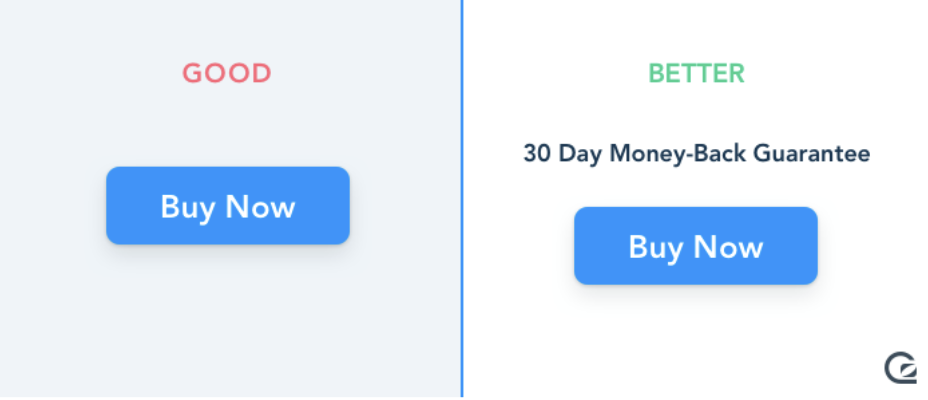
Source: gosquared
Apart from relaying crucial information, a modal should push the reader to perform a specific action. If your call to action is unclear, the reader will skim past the pop-up and proceed to the content on your site.
Therefore, we recommend you make work easier for your reader by giving them clear options to interact with the pop-up. It would also help to design the CTA button appropriately. Ensure the button stands out from the rest of the pop-up without violating branding guidelines or jarring the reader too much.
5. Craft an Escape Hatch
Let's face it; not all readers will take their time to read the pop-up. Most of them can't wait to close it so they can proceed to the content that brought them to your site.
Therefore, giving your readers an easy way out would be best, so they are not frustrated with your website. A clear escape hatch improves the user experience by improving functionality and disappointment.
You could allow them to return later, snooze the pop-up, hit the escape button to leave, or design an X button on the top right corner.
6. Pay Attention to Sizing and Location
As you design your website, it would be wise to consider the modal’s size and location.
The reader becomes overwhelmed when it is so large that it occupies the entire screen. They also feel like they are no longer on track with the goal that brought them to your website.
Therefore, it would be wise to ensure it doesn’t take up too much space on the screen. You could also position the modal in the middle of the screen to grab your reader's attention.
7. Implement Action-Triggered Modals
One of the most annoying pop-ups is known as system-initiated modal windows. They spring up at you as soon as you click on a website and restrict access to the content material until you interact with them or hit the exit button.
An excellent alternative would be to use action-triggered models relevant to the user's journey as they navigate your website. For example, if a reader hovers over an icon, a modal would appear with an onboarding checklist that provides more information on maneuvering the website.
8. Trap Keyboard Navigation within the Modal
Your readers could access your website via their computers or their mobile phones. There is no point in having a modal if the user can still access the content behind it.
Therefore, it would help to restrict keyboard navigation to only areas within the modal, especially if the user is using their mobile phone. Trapping keyboard navigation will keep the reader engaged and make adopting new features easier.
9. Use Progress Bars for Modal Tours
There are bound to be new users to your website that are unfamiliar with your products. The right modal design can welcome them to your site and explain the value they stand to gain when they sign up for your products.
Progress bars are also excellent tools for user onboarding and can help boost your completion rate by a significant percentage. Research reveals that three-step tour models had the highest completion rate.
10. Stay Consistent with User Knowledge
As the saying goes, there is no need to reinvent the wheel. Since you have done your research, you already know the kinds of UX and SEO patterns and designs that are popular among readers today. Therefore, it would be best to stick with what your audience is used to rather than designing something new. Your readers might be unhappy with the new design, causing them to lose interest in your website.
Employ UI Modals the Right Way
In a nutshell, modals are a creative way to boost user engagement as long as you get them right! Avoid using a modal to communicate massive amounts of information.
Also, avoid placing one pop-up on top of another. It also wouldn't be a great idea to use modals to provide additional information or relay system-wide notifications.
Looking for UI help? Connect with the best UI/UX agencies in the business on The Manifest.

Simran Sahni
Team Lead and Head of Content, Outreach Monks