5 Best Practices for App User Onboarding

5 Best Practices for App User Onboarding
How do you keep new users hooked on your mobile app? Find out 5 proven best practices for effective app user onboarding.
Want users to fall in love with your app at first sight? Read this.
Nearly a quarter of app users (23%) who download an app never return to it after the first use. That’s 1 out of every 4 people, and businesses are concerned.
This is why effective app user onboarding is important.
User onboarding is the process of getting new users to keep using your app. Because if they don’t, all your efforts to acquire them go to waste.
A key aim of onboarding is to make sure users achieve what they set out to accomplish with your app – quickly and hassle-free.
Apps that offer successful onboarding experiences know their customers’ goals and make it easy for them to achieve them.
Good app onboarding practices assure users that you have their goals in mind. They build trust and encourage users to revisit your app or commit to your company.
On the other hand, a bad onboarding experience can be disastrous for your app. It can lead to high churn rates, low free to paid conversions, and significant drops after signup.
This article highlights some best practices for app onboarding to help you engage new users and get them hooked on your app:
- Give users what they want
- Streamline your app registration process
- Make app users feel secure
- Incorporate contextual tips instead of long tutorials
- Use in-app progress monitoring
1. Give Users What They Want
People download your app when they believe it can benefit them in some way. So, you need to show them that your app will give them what they want from the start.
To do this successfully, you need to know why users download your app in the first place.
Highlight the core benefits of your app quickly. For example, a travel app may present its features in three short sentences:
- Log in from anywhere
- Set your location
- See other users’ recommendations for the best places to visit
A description like this shows users that you understand their needs. It assures them your app will deliver, which builds trust.
Keep your description of app features concise to avoid overwhelming your users. Present one concept or feature at a time and allow users to swipe through the information quickly.
Handy, a platform that helps homeowners find and hire services such as a clear, uses a similar concept for its app onboarding flow.
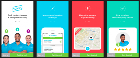
Notice how Handy’s descriptions are short and sweet and accompanied by visuals.
2. Streamline Your Registration Process
Nearly three-quarters (72%) of app users want the onboarding process to take a minute or less.
The greater the onboarding time, the more frustrated they feel and the more likely they are to stop using your app.
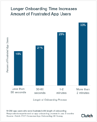
To reduce the time your app onboarding experience takes, streamline your signup process – if your app requires one.
Avoid asking your users for unnecessary information. If you have a flashlight app, for example, you really don’t need the user’s email address.
If your app requires registration, offer users the option to “sign in via Google/Facebook” to save time.
Avoid forcing your users to go through a cumbersome process to sign-in. Like Spotify, give them the option to sign-in via Gmail or Facebook.
If you do need users to create an account, use inline checking for available usernames, and mention password requirements the moment a user clicks on the relevant field.
Tumblr’s app is one example of using inline checking during the app onboarding process.
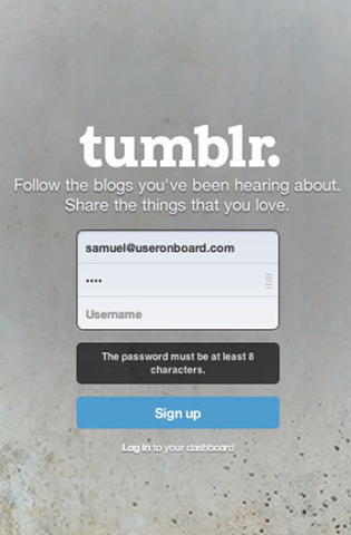
It can be frustrating to complete an entire form, only to receive a prompt after pressing the submit button that one of the fields must be re-entered.
Even the appearance of a shorter input process can make a difference. QuickBooks does this pretty well.
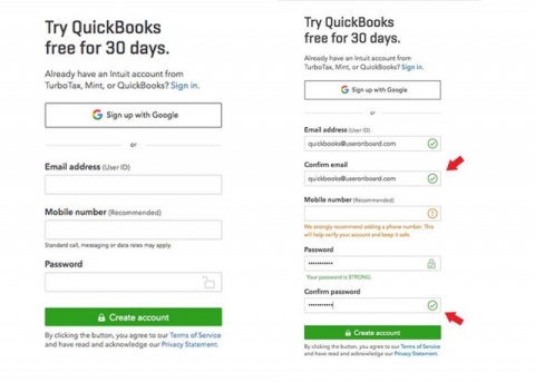
Hiding duplicate fields such as “Confirm Password” or “Confirm Email” until a user gets to them ensures you don’t lose users because your forms look like a headache to fill out.
3. Make Users Feel Secure
App users are worried about disclosing private information online. They want to know their data is in safe hands and won’t be misused.
In fact, 82% of app users feel it’s important to understand why they need to provide personal info during onboarding.
And that’s not all. Nearly 90% of app users say the security of their personal information influences their satisfaction with an app.
Assuring your users their data is secure is crucial for your app’s success, especially if it requires sensitive information.
PayPal is a good example of how to assure your users their data is secure.
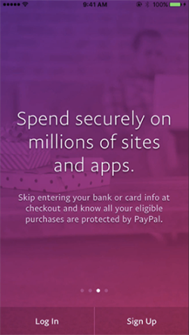
They assure their users the app is secure and all purchases are “protected.”
If you’re a banking or other financial app that requires sensitive information, such as a credit card or bank account number, make sure to include a line or two that assures the user you have a system in place to protect them from hacks.
To further put app users’ minds at ease, prepare your them for all the device access permissions your app might require, so that the requests don’t seem invasive.
One way to do this is to ask for permission in-context. Instead of bombarding your user as soon as they open your app with requests for access to their camera, SMS messages, location, and other services, allow them to first:
- Get through the entire onboarding tour to better understand what your app is about
- Actually use your service before prompting access to a device feature
Foursquare does this well.
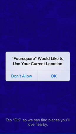
As this example shows, one tactic to build trust while asking for permissions is to explain why you need access to a particular feature in the background of your request.
4. Use Contextual Tips Instead of Long Tutorials
To ensure your app onboarding process is not too long, boring, or tedious, consider progressive onboarding where you explain your app’s functionality over time, instead of all at once.
You can execute a progressive app onboarding process in multiple ways.
For example, Birdhouse, a notepad app that helps users remember ideas for Twitter, only elaborates on its “History” feature once users familiarize themselves with the app and add a first draft.
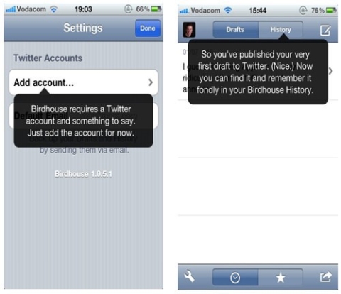
The tactic is effective because it shares the history feature when it’s most relevant to users – right after they publish their first draft.
Other apps, like the BBC, allow users to engage with its product over a long period.
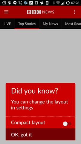
The BBC app shares that people can change the layout only after they are loyal users.
5. Use In-App Progress Monitoring
Apps that give users a sense of achievement fare better than those that don’t.
If your app allows users to log their progress or win rewards for tasks they accomplish, they’re more likely to use your app repeatedly.
A survey of app users that gamified elements, such as progress bars, point tallies and badges/stickers, make apps enjoyable for users.
Humans value activities that lead to tangible achievements, even if those achievements are only virtual.
Social media app Snapchat is aware of this. They tapped into the gamification technique via their "streaks" feature – which rewards users with emojis for sending each other snaps for at least three consecutive days.

It’s a small feature, but it encourages Snapchat users to communicate on the platform more to earn a “Snapstreak.”
Users proudly screenshot their streak-days (some over 500) and display the images on other social media platforms.
This simple gamification system lead to a rapid rise in Snapchat’s popularity.
Another app that used gamification was the election-voting app created by the Hillary Clinton 2016 Presidential Campaign.
The app rewarded users with “stars” each time they completed a task, such as registering to vote.
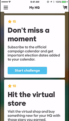
As this review explains, it was a great way to keep users engaged.
App Onboarding Experience Key to Successful App
Onboarding is one of the most essential parts of app-building today. An onboarding experience can make or break the app you spend money, time, and effort creating.
Your app needs to communicate to new users that you want to start the relationship by providing them with easy and accessible ways to get on board.
The best practices above will help you, but they’re only a start. Only you can determine the best onboarding techniques for your app.
Mix-and-match from the section above, or read up on some more techniques, and learn from examples by exploring these reviews of different onboarding experiences.
