Amazon’s User Experience: A Case Study

Amazon’s User Experience: A Case Study
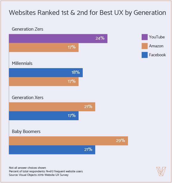
Most generations rank Amazon’s user experience as the most appealing. Here’s why.
Everyone appreciates an accessible and functional website. A recent survey found that most generations rank Amazon’s user experience (UX) as the most appealing. Of those surveyed, Amazon’s UX ranks highest among baby boomers (29%) and Generation X (21%).
Designing user experience for multiple generations is a challenge. Many older users are only recently familiar with e-commerce and can get flustered by more complicated websites. Meanwhile, younger users tend to favor website UX that is visual and intuitive in nature, which would repel less tech-savvy users.
Amazon succeeds by offering a minimal, search-oriented user interface (UI) that accommodates both digital natives and internet newcomers.
This case study will discuss how Amazon’s UX makes it appealing for disparate generations:
-
Amazon’s UX is search-driven
-
How has Amazon’s UX changed?
-
Amazon’s product pages reassure buyers
Amazon’s UX is Search-Driven
Amazon’s UX is designed to increase the likelihood of visitors making a purchase. To this end, the search bar is prominent on every page. The search bar makes it easy to find products – but also to filter, refine, and view search results in an open and readable fashion.
Amazon’s search function is “state-of-the-art," according to a recent study by the research group Baymard Institute. The search autocomplete, filtering, and guidance functionality excels at finding what visitors want.
The algorithm also personalizes the homepage content to the user’s search interactions in order to better enable future purchases. As seen below, various visual homepage elements are influenced by the search function, including:
-
Personalized recommendations
-
Recent browsing history
-
New products
-
Shopping cart
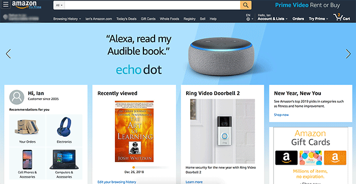
This array of relevant products both greets the user and highlights a likely path to purchase. Personalization at every turn ensures that visitors find more of what they want, and enhances the site experience to drive customer loyalty.
Ultimately, Amazon’s UX succeeds because every generation knows how to perform a text search. According to the B2B publication Business Inder, a whopping 94% of people surveyed have purchased from Amazon in the last year.
Whether or not visitors arrive with a product in mind, the usability of the search function caters to all. The usability is elevated for older users who are unaccustomed to following visual cues on websites and have yet to realize that an image represents a live link.
To this point, the calls to action in the homepage product boxes appear as both blue hyperlink text and as a product image. Offering both text and image-based cues allow the retailer to accommodate and convert all users.
Amazon’s linear and text-oriented approach to UX runs on personalization and usability.
How Has Amazon’s UX Changed?
Since its inception in 1994, Amazon’s UX has changed little. According to a former employee, the company’s approach to UX is: ‘if it ain’t broke, don't fix it’.
Even in the early days of the internet, Amazon’s open and highly navigable UI could be accessed by anyone with a hint of web experience.
Overhauling the site experience could have crippled the business model of enabling repeat purchases and increasing customer lifetime value. It would also have alienated a fledgling customer base that only became profitable after six long years.
In fact, Amazon’s consistency still contributes to its appeal with early adopters, Gen Xers and baby boomers, who rank Amazon’s UX highest of all. Recent research also found that older generations are more averse to website changes than younger generations. Even today, altering an effective UX is a lose-lose for both existing and incoming users of older generations.
While the UX remained constant, the navigation menu has been modified to provide the most linear shopping experience, as seen below.
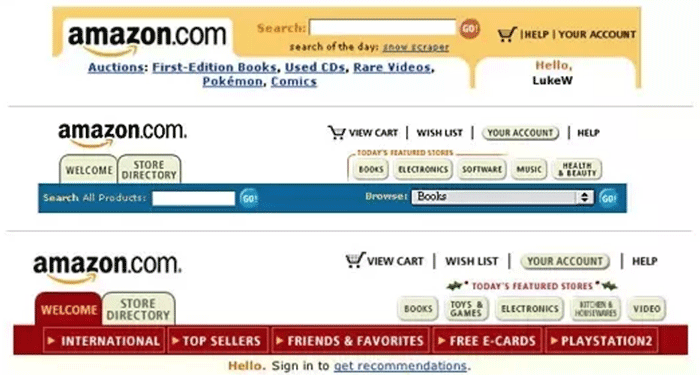
Despite the outmoded graphics, color changes, and reorganized tabs – the basic structure remains intact. Amazon’s current navigational menu is more streamlined, as we saw in the previous example.
Most notably, the search bar was expanded to give it more prevalence on the page. The clunky product category buttons were assimilated into the header menu, which simplifies the navigation area and improves its readability.
The navigation tabs themselves have also been replaced. Formerly for “books” or “electronics,” the tabs now point to the user’s browsing history and personalized recommendations.
In an age when Amazon is known to carry all types of products, this optimization increases the chance of visitors finding, remembering, and buying what they like. Similarly, the “Accounts” area at right uses a bold font to call attention to wishlist items and ongoing orders to increase sales.
Constantly tweaking the site to align with buyer motivations helped Amazon to grow and retain a loyal customer base.
Amazon’s Product Page Reassures Buyers
Amazon’s product pages are constantly split-tested to drive optimal conversions.
Page elements are adjusted to best emphasize convenience, value, and trustworthiness. By reducing the friction around buying, Amazon increases sales.
Seen below, the product page for Braun electric toothbrush heads gives the visitor a clean and clear path to purchase.

Plenty of white space emphasizes both the product and its key selling points. The product rating sits below the product name to guaranteed its visibility and to highlight the social proof which validates the purchase quality. At left, the benefits are stated while the product image reaffirms the value by announcing “Extra” on the packaging.
On the order detail side, the eyes are most drawn to the bold black text that mentions “Free Shipping,” “Free Delivery,” and “Get it.” Amazon knows its customers want their products both cheaper and faster. These power phrases prompt action while reaffirming the savings and speed available with every order.
And if an item is too pricey, signing up for Amazon’s Reward Visa can affords the shopper a $50 discount and the satisfaction of purchase. Every element on the page exists to increase positive sentiment around a purchase.
Amazon uses the product page to spotlight key benefits, reassure shoppers, and thereby optimize conversion rates.
Learn 5 best practices for website UX.
Studying Amazon’s UX
Amazon is a name synonymous with e-commerce. The company’s search technology and user experience have afforded online shoppers of all ages a reliable and rewarding experience for 25 years. This accessibility and usability will attract and retain users for the foreseeable future.

Ian Heinig
Writer, Clutch
Ian Heinig is a copywriter who loves big ideas, brand strategy, and psychology. Most days he's drafting new ways to share value, but he's also an illustrator, yogi, and freelance burrito analyst. Find him at radicalartsdepartment.com.