10 Ways to Optimize Your Lead Generation Forms

10 Ways to Optimize Your Lead Generation Forms
Only 22% of marketers are satisfied with their conversion rates. Here are 10 ways to optimize your conversions and generate more high-quality leads for greater revenue.
Generating leads and email sign ups is critical to your marketing efforts. Done correctly, a dedicated landing page or email capture form can be a gateway to qualified prospects.
However, capturing leads without an optimized conversion form feels like a Herculean task.
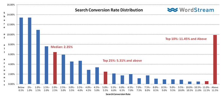
Considering that the average conversion rate of lead generation forms is between 0.5 - 3%, a few tweaks can make a huge difference in lead quantity, quality, and the bottom line.
According to Peep Laja of ConversionXL, conversion optimization hinges on finding the best way to demonstrate value to your users.
“Serious gains in conversions don’t come from psychological trickery, but from analyzing what your customers really need, the language that resonates with them and how they want to buy it,” said Laja. “It’s about relevancy and perceived value of the total offer.”
Reworking your conversion forms is not a one-off procedure but a continuous process.
Here are 10 tips to optimize your conversion forms:
- Place your conversion form above the fold
- Sell the email signup
- Use fewer form fields
- Create a strong call to action
- Align your call to action with the body copy
- Guarantee privacy
- Provide social proof
- Tell users what happens next
- Create a beautiful form
- Highlight errors clearly
1. Place Your Signup Form Above the Fold
The visibility of your signup form is critical to lead generation success. Place your conversion form above the fold (the area visible without scrolling) to ensure maximum conversions.
According to research by Nielsen Norman, 80% of people’s web page time is spent looking at information above the fold.
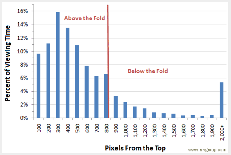
Users may get confused and bounce if they’re unsure how to access the promoted offer.
According to research by Google, advertisements placed 50% below the fold suffer a 66% drop in conversions. Users don’t scroll without reason, so immediately provide your signup form for best results.
2. Sell the Email Signup
Web signups are a transaction where users give you an email address, name, or other information in exchange for future value. Like any transaction, some people will need a bit more persuading. Your page copy should motivate him or her to convert.
The best way to encourage a sign up is with a value proposition, or a statement of benefits. For example, SEO tool Backlinko promises to deliver a 25,000-person surge in web traffic if the user downloads their ebook.
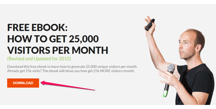
People are busy. If you want them to share their time and information, you must offer a rewarding payoff.
3. Use Fewer Form Fill Fields
Each field on your conversion form creates friction for users. Asking for less information will increase your conversions because users will have less time to second-guess the exchange.
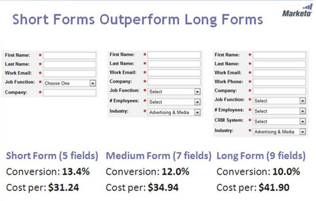
Studies confirm that short forms outperform the rest. The optimum conversion rate for a three-field form is 25% but only 15% for a six-field form, according to the conversion tool Unbounce.
Your goal is securing the lead, so keep your form simple and only ask for names and emails. You can ask for more detailed information as the customer relationship progresses throughout the marketing funnel.
For example, a newsletter signup page should be basic because the prospect may be just learning about your business. However, an ebook offer warrants additional fields because the prospect is further researching your company.
The faster and simpler the conversion form, the less resistance you’ll encounter, regardless of the prospect’s stage in the marketing funnel.
4. Create a Strong Call to Action
The more compelling your call to action (CTA), the greater your conversion rate will be.
As the cornerstone of your lead generation efforts, the CTA should instruct people how to proceed and compel action with a value proposition.
For best results, make your CTA language active, specific, and urgent. The example below illustrates the importance of CTA copy that clearly signals value to users.
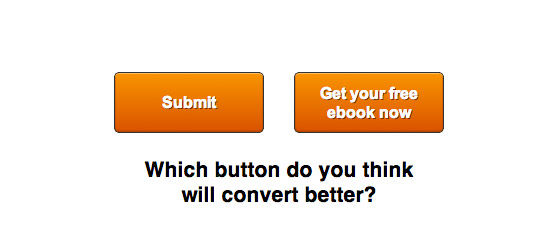
A great CTA makes the difference between a high conversion rate and a high bounce rate.
Certain words will create unwanted friction for users:
- Submit
- Download
- Order
- Buy
Use active verbs to communicate value:
- Gain
- Access
- Receive
- Get
Unbounce found that changing their CTA verb from “Order” to “Get” increased conversions by 38%.
Conveying maximum benefits to the user is an essential factor of conversion optimization.
5. Align Your Call to Action With Body Copy
Your conversion forms will achieve greater impact if your messaging agrees throughout. Aligning the CTA, body copy, and headline creates a linear and persuasive form that’s hard to resist.
According to Unbounce, over 90% of visitors who read the headline also read the CTA.
People are distracted online, but users will continue reading if your headline includes the right keywords. Restating your offer cements its relevance and boosts conversions.
Here we see Unbounce repeat their target keywords in the offer headline, the subheader, and the CTA button.
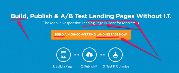
Aligning “build” and “landing page” addresses both the needs of the audience and search engine optimization (SEO) requirements. If it resonates, it’s worth restating.
6. Guarantee Privacy
If your prospects don’t trust you, they won’t convert.
Including a privacy statement or linking to your privacy policy is a great way to communicate your trustworthiness. This way, users feel safe sharing their contact information with you.
Aim to sound authentic and transparent. You can be like Shopify and use a direct, no-nonsense tone.
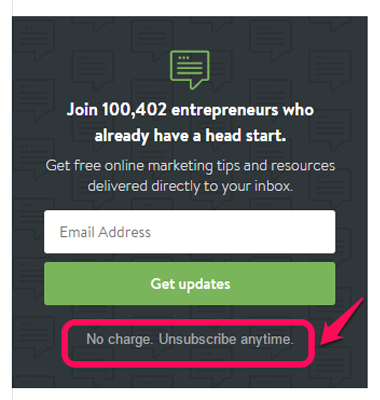
Avoid using trigger words like “spam” or “fraud,” as these can reduce conversions by as much as 18%.
It may seem small, but securing the trust of users is a huge part of generating leads for your business.
7. Provide Social Proof
Nobody wants to get duped into filling out a signup form. Social proof – when people look to the actions of others to inform their perceived right action – is a powerful way to alleviate hesitancy around sign ups and illustrate your product or service’s benefits.
For example, Basecamp highlights its user base in a way that both promotes sign ups and reinforces their value proposition.
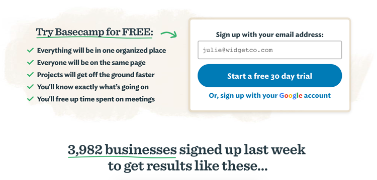
Whether in the form of testimonials, supplier endorsements, or 3rd party certifications, showcasing how others trust your business is a great way to optimize your conversion strategy.
8. Tell Users What Happens Next
Telling people what follows after they fill out an online form will remove doubt and drive conversions.
Conversion rate optimization relies on creating certainty in prospects. After all, uncertainty is a form of friction, and friction halts action.
Below, retirement service Wealthfront invites users to “Invest Now,” and kickstart their financial future.
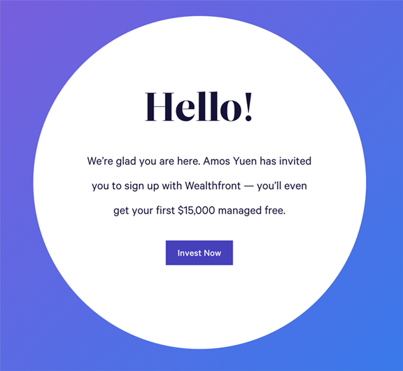
Using exciting and active language will help you ignite anticipation and drive your audience to action.
9. Create a Beautiful Form
The more polished your signup form, the more credibility and conversions you’ll achieve.
This is because consumers perceive quality design as an indication of an established and trustworthy company.
Here are a handful of design principles to remember:
- Use contrasting colors for visual clarity
- Leave white space to help the form stand out
- Apply color psychology (the study of how hues affect behavior) to produce an optimal response
- Use a visual hierarchy, so the page layout conveys the order and importance of the content
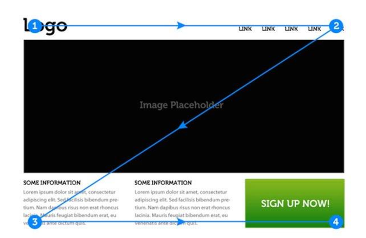
A well-designed form will also improve your website's user experience (UX).
Investing in your site appearance will enhance the perceived value of a conversion to users. As a result, you’ll generate a greater volume of valuable leads.
Additional Reading: 7 Ways to Improve Your Website UX
10. Highlight Errors Clearly
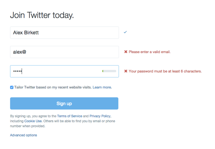
If someone misenters information or skips a mandatory field, communicate this clearly.
When the user makes mistakes, keep those fields populated, so they can see and correct the error. If users are left guessing what happened, they may abandon signing up entirely.
Below, Twitter uses “inline validation” – where the form automatically detects if an entry is in the correct format – to correct slip-ups, smooth conversions, and improve the overall user experience.
Optimize Your Conversions
High-converting lead generation forms promise big value while removing user doubts about providing personal information.
Addressing these lead generation form optimization factors will help you streamline and enhance the conversion experience.
If you minimize friction and maximize value for the audience, your online forms will deliver a stream of high-quality leads.
