10 Tips to Optimize Your Web Forms

10 Tips to Optimize Your Web Forms
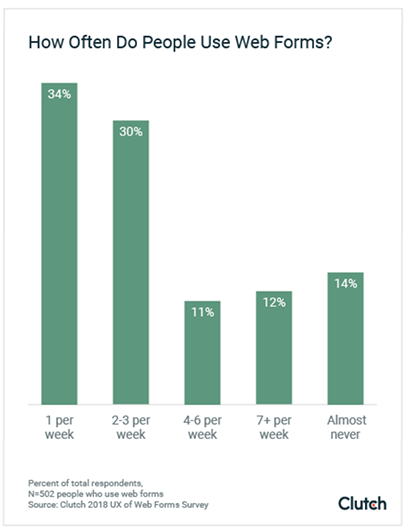
34% of people fill out one or more web forms each week. Here are 10 ways to boost conversions and streamline the user experience for your web forms.
Completing web forms is nobody’s favorite activity. However, consumers still complete them because they are often a gateway to something of significant value.
34% of people complete one or more web forms each week, according to a recent survey.
A business that creates effortless web forms is sure to benefit. A linear and intuitive web form experience is guaranteed to increase your conversion rate.
The principles of web form design are focused on creating a frictionless user experience (UX). To streamline your web forms, align them with your audience’s motivations.
What does the user want? Is it easy to acquire?
When optimizing your web forms, aim to enhance their usability. This means using web form best practices to reduce clicks, keystrokes, and headaches that make web forms longer and harder to complete.
Here are 10 practical techniques for optimizing web forms for easy use:
- Minimize form fields
- Reduce the need for typing
- Spread long forms across separate pages
- Avoid duplicate fields
- Skip the reset and clear buttons
- Match field size and type to the input
- Distinguish required from optional fields
- Avoid placeholder text
- Reduce effort with smart defaults
- Eliminate the captcha box
- Use visual questions
1. Minimize Form Fields
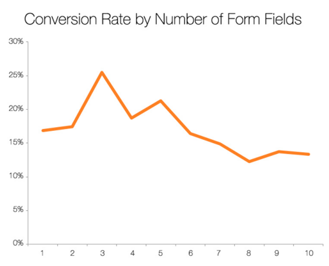
Less is more when designing web forms. A study by HubSpot found that forms with three fields earned the highest conversions.
Removing all unnecessary fields will result in an easy-to-use form that converts.
After all, users will only complete a form if the value offered by the web form is greater than the effort required to complete it. However, this means that if you are offering a higher value resource, you can ask more questions.
Ultimately, though, err on the side of caution when it comes to the number of web form questions – a minimalist approach to data collection is the best route to a successful web form.
2. Reduce the Need for Typing
Typing is the most time-intensive aspect of web form conversions, and often results in errors – especially on mobile. Substituting keystrokes for buttons, sliders, or features like autocompletion will hugely reduce the effort needed for completion.
For example, filling out addresses can be simplified with autocompletion software. Both Google and Parsley offer a JavaScript API for your site code to cut down on typing.
Adding autocomplete to your forms will significantly reduce the time needed to convert, which will boost your conversion rates.
3. Spread Long Forms Across Separate Pages
You can improve your web form’s UX by spacing the form over multiple pages.
As mentioned in tip one, fewer form fields will reduce the perceived effort of converting.
If your form must be longer, though, distributing the fields over multiple pages will make the form less visually overwhelming.
In the example below, Groupon uses a two-step signup process to create a sense of simplicity and momentum.
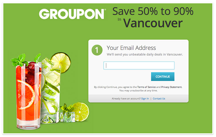

The couponer makes good use of numbers on top of the forms to signal progress in the form. Multi-step forms benefit from the endowed progress effect, which states that we’re more likely to complete a task if there’s a suggestion of advancement, like a progress bar or numbered pages.
A study from Clutch confirms that 90% of people prefer web forms that use progress bars to manage their expectations about completion time.
4. Avoid Duplicate Fields
Asking users to repeat their entries needlessly complicates a web form. Though duplicate fields help to reduce errors, they also prolong the signup process.
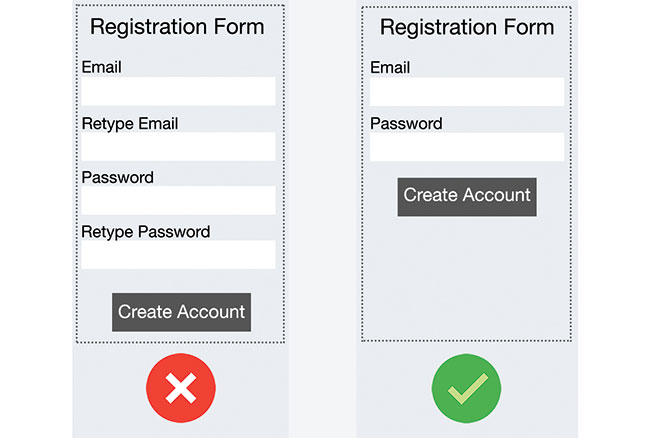
The risk of frustrating users doesn’t outweigh the benefits of an error-free web form experience. Rather than add friction with another field, better to address issues as they arise with inline validation.
5. Skip the Reset and Clear Buttons
With a clear or reset button, users are more likely to delete their entries accidentally than to actually need a restart. Losing conversions to misclicks is a situation that’s easily avoided.
Forms that collect financial information should offer a “Cancel” button to erase the user information. However, to avoid misclicks, the “Cancel” button should appear with much less visual prominence.
For example, this dialog box from LinkedIn makes sure the options are unmistakable.
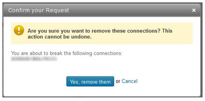
Clearly differentiating between action types will ensure that your forms don’t confuse and distract users from completion.
6. Match Fields to the Type and Size of Input
The best web forms are well-proportioned. For example, if you’re considering a drop-down menu but only need to offer 2-3 options, use radio buttons instead. Radio buttons require one click, are immediately visible, and can be clicked quickly.
Your form field sizes should also align with the form titles to suggest the required input. A study by Baymard Institute found that users are puzzled when a field is too long for the suggested information, causing them to second-guess if they understood the label.
Below, Skype’s card number and verification code fields are over-long and it’s confusing.
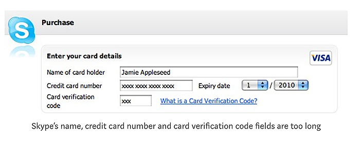
To create a linear and explicit data entry process, use the appropriate size and type of form field.
7. Distinguish Required from Optional Fields
Try to avoid optional fields on web forms. If you can’t, clearly indicate which form fields are optional. Users will become frustrated if they have to decipher which fields are optional and which are mandatory, as this takes time.
You can denote optional fields with an asterisk. Just be sure to provide an explanation somewhere.
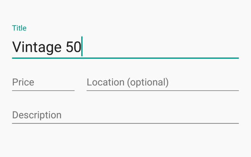
The example below shows the word “optional” in a different color.

Users should clearly understand which form fields are necessary and which are optional.
8. Avoid Placeholder Text
Replacing form field labels with placeholder text (inline labels) creates numerous usability problems.
Once the user clicks the placeholder text, the label disappears. Without any visible reminder, users may forget the expected answer and become frustrated.
Another common issue is that users see a box filled with text and skip it – only to be asked to fix the omission afterward.
Floating labels are an effective way to use placeholder text and reduce clutter on web forms. Seen below, once the field is tapped, the placeholder text changes location to “float” about the form field.
Floating labels ensure that users have the information they need while enhancing the form design.
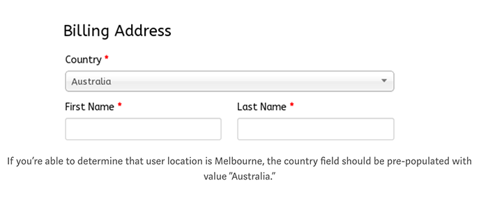
9. Reduce Effort with Smart Defaults
Smart defaults let you set a default answer to a question based on the most probable response. This helps you minimize the effort from a large portion of your respondents.
For example, do people really need to fill out their country? You could just suggest their country from their IP address and you’ll be correct, most often.
Anything you can do to decrease the time it takes users to fill out your web form will help increase conversions.
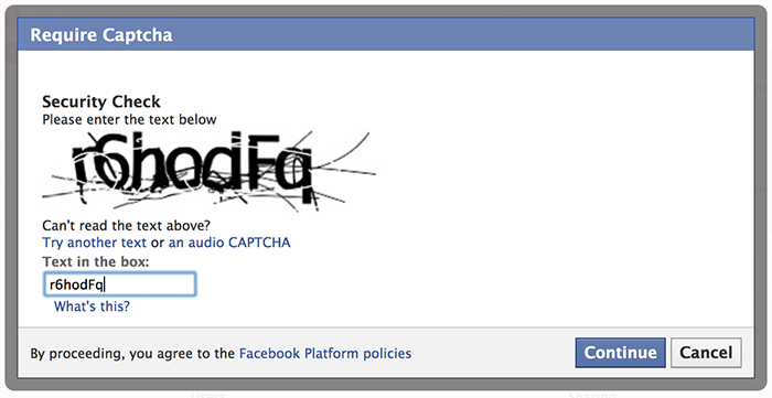
10. Eliminate the Captcha Box
Research by Stanford University found that CAPTCHAs – the boxes that identify if users are human – can reduce web form conversions by as much as 30%. Obviously, asking users to decipher a word scramble creates a lot of friction.
If you’re worried about spambots, you can use a honeypot. A honeypot will create a spam-blocking screen that only bots will fill out, revealing them while blocking their submission. This is a straightforward way to reduce spam and streamline the user experience.
Make Web Forms Easy to Use
Design your web forms to allow a fluid exchange of information.
Optimizing your web forms hinges on using techniques that shuttle users between fields without hindrance.

Ian Heinig
Writer, Clutch
Ian Heinig is a copywriter who loves big ideas, brand strategy, and psychology. Most days he's drafting new ways to share value, but he's also an illustrator, yogi, and freelance burrito analyst. Find him at radicalartsdepartment.com.