5 Web Design Trends That Are Out of Fashion
5 Web Design Trends That Are Out of Fashion
Contributed ContentWeb design is essential to keep people interested in your business and leads to convert. Too many businesses use poor web design tactics that deter people from staying on their site. Consider how your website looks and make sure it is optimized for the user.
Web design trends are constantly changing. Infographics, image sliders, and long-form content all have gone in and out of style over the years.
Still, while fashion trends seem to come and go quickly, in web design that process happens at an even faster rate.
During a web design project, businesses often make the mistake of drawing inspiration from outdated design practices, and without a cutting-edge web designer, you can end up with a site that is reminiscent of past times.
To help you keep your website modern, we’ve compiled the most outdated design trends that could put your website on the “worst-dressed” list.
5 Outdated Web Design Trends
Businesses should make sure their web design is up-to-date and relevant to the user experience. Websites that are outdated and slow can harm a businesses’ chance at sales and leads.
1. Image Sliders or Carousels
Image sliders or carousels used to be all the rage many years ago. Now, however, they are the equivalent of stretch-stirrup pants in the web design world.
All the latest research & data shows that sliders create a poor user experience on websites because web visitors do not read past the first slide.
Image carousels that rotate automatically are also a bad practice for web accessibility because some web visitors need a longer time to read the content on the slide.
For all these reasons, web designers have been steering clients away from sliders for years now, but there are a lot of older sites with this style.
Unfortunately, businesses can make the mistake of viewing lots of old sites with this trend and think it is still in fashion.
An alternative to sliders with rotating content is to consider placing an engaging image or video on the homepage of your website.
With the right kind of visuals, you can draw in a visitor and provide an optimal user experience.
2. Aggressive Pop-Ups
Unfortunately, pop-up messages continue to be used on a lot of websites. Website owners try to use pop-up forms to collect email addresses from web visitors to build an email list.
However, pop-up forms can be distracting and annoying, especially on mobile devices. You’ve probably experienced this on a site where a pop-up appears before you had a chance to figure out what you needed or wanted from the site.
Sometimes pop-ups can overcrowd a page and make it challenging for users to know what to focus on.
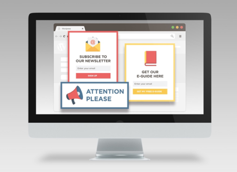
Numerous pop-ups are detrimental to your marketing strategy as people get frustrated with the constant messages and ads ruining their experience.
For this reason, Google has been steering the internet community away from pop-ups. In 2017, Google announced that any websites and mobile pages with intrusive pop-ups will rank lower in search results.
An alternative to pop-ups is to add live chat to your website. Live chat gives web visitors an easy way to contact you and live chat systems can be set up to collect an email address from someone before they start a chat.
Using better alternatives to pop-ups can help increase how long people stay on your page and offer a more immersive experience.
3. Generic Stock Images
Using bland generic stock images will undermine even a professional web designer and can give the wrong impression of your business.
When visiting a site, a web visitor will make a decision in just a few seconds to stay or leave your website, so your design needs to be engaging and reinforce your business’ messaging.
Even if you have custom photos for your website, you’ll probably need a few stock images for your web design.
When selecting stock images, it’s worth investing in some high-quality ones from Getty Images or Shutterstock. While you pay more per image on these platforms, it’s worth getting a few high-quality ones rather than resorting to bland, generic images.
An experienced web designer can help you select what’s called life style images. They can also customize the stock images by using gradients and other techniques to fit your branding and messaging.
4. Too Much Animation or Movement
Once designers and developers had the ability to add animations and background videos, things got out of hand and websites became overloaded with them.
Similar to pop ups, having too much movement on a web page can distract website visitors, hurting the user experience and conversions.
Before adding any animation, ask yourself what purpose it serves and if the animation ties into your messaging and branding.
It’s best to use micro-animations. These are small effects on a web page and they enforce the message and steps you’d like the web visitor take.
For background videos, avoid using a video with lots of movement. You want the video to draw the visitor into the site, but not distract them from reading your web content.
If you are placing a background video at the top of your home page, use a short video that can be played on a loop smoothly. Long videos are often larger files and can slow down the load of your web page.
By optimizing your videos, you have a higher chance of keeping visitors on your website longer.
5. Dense Content
In the past, when web visitors could only view a website on a desktop screen, no one minded reading through lots of text. Websites were built with tons of pages and dense paragraphs of text on each one.
Today, people are so used to scrolling on mobile devices that this behavior has become universal. Web visitors now scan content and will bounce from a page if they have to read through tons of text to find what they are looking for.
All sites should now be designed from a mobile-wise design perspective meaning your web design team should consider how the content, design, and navigation all look on mobile first.
A blog or resources area is a great way to continue to add content to your site for SEO while keeping the navigation and main pages simple.
By providing easy-to-read and valuable content, people will have a reason to continue returning to your site.
Find the Right Inspiration for Your Website Design
While everyone loves an ’80s throwback party, it’s best to avoid the outdated trends on your website. The next time you redesign your website, pay attention to what sites you are referring to for inspiration.
Your new site could look outdated before it launches if you draw inspiration from older design trends.
To avoid getting lost in the times, regular updates and design tweaks can extend the life of your site and keep your business looking cutting-edge.

Mikel Bruce
CEO, TinyFrog Technologies