9 Tips for Compelling Email Unsubscribe Pages

9 Tips for Compelling Email Unsubscribe Pages
Find out how to turn email unsubscribe requests into opportunities for customer relationship-building.
According to a recent survey, nearly 70% of businesses invest time and money on email marketing.
If you’ve ever spent time growing an email list, you probably know that email unsubscribe requests are a natural part of the process. Today, we’ll be showing you how to handle these cancellations in way that can benefit both you and your customers.
The average email unsubscribe rate is between .17% - .27%, depending on your industry and company size.
Here are some common reasons why people unsubscribe from email lists:
- They’re getting too many emails overall and need to cut back
- They’ve changed their email address
- They need a break
While you may not want to let anyone go, it’s necessary (and legally mandated) to allow readers a way to easily unsubscribe from your email list at any time.
The good news is that there are ways to use the unsubscribe process to strengthen your relationship with readers, even as they’re in the process of saying goodbye.
In this article, we’ll take a look at some of the ways you can “turn lemons into lemonade” with unsubscribe forms. You’ll discover:
- What not to do on email unsubscribe pages
- How to encourage email subscribers to stay on your list
- How to say goodbye to email subscribers
What Not to Do on Email Unsubscribe Pages
Since people unsubscribe for many reasons, you want to be sure they feel welcome to return at any time.
How can you avoid annoying customers during the process, so they don’t leave with a bad impression?
1. Don’t make people log in to unsubscribe.
Forcing your subscribers to type in their email address and password is a quick way to get marked for spam.
If the person doesn’t remember their login information, or if they don’t have the time to fill out a form, the only alternative for them is to mark your email address as “spam.”
Marking your email address as spam quickly removes your emails from their inbox, so they never have to hear from you again.
Getting marked as a spam sender can harm your deliverability rates if it happens often enough.
Email providers keep an eye on spam reports. If you get flagged as a repeat offender, it can raise the chances of all your future correspondence ending up in the spam folder.
2. Don’t require a survey.
If your reader is at work or otherwise short on time, requiring them to read through a long list of choices in a survey/poll can chase them away.
If you want to collect information on why people unsubscribe from your list, try adding a simple and polite survey on your unsubscribe confirmation page. But, don’t force readers to answer questions in order to unsubscribe.
For example, Next Avenue news offers a one-button unsubscribe, then confirms it with an optional poll.
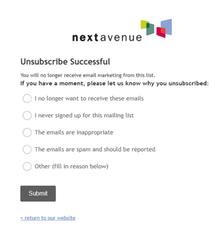
In the example above, the design is productive because it makes use of large fonts that are easy to read. Also, the choices are simple and limited in number, which helps viewers make a quick selection.
3. Don’t use one-click unsubscribe buttons.
When a reader scrolls to the bottom or your email and hits “unsubscribe,” don’t pull them off the list just yet. Be sure the button leads to a page where they confirm their cancellation before they’re taken off your list.
Otherwise, the reader can unsubscribe by accidentally hitting the link.
Or, sometimes users hit “unsubscribe” when they’re thinking about dropping off your list and want to know what their options are.
For example, Laura Gellar Cosmetics offers a one-click unsubscribe, but if you didn’t intend to leave the list, there’s no way to undo it.
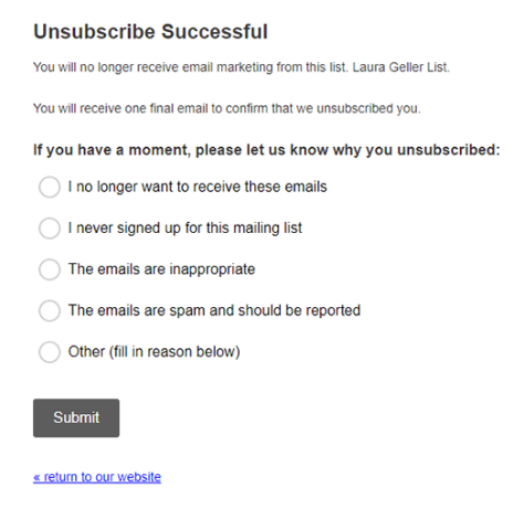
Worse than a one-click unsubscribe is the one-click followed by an unfriendly message.
In the example below, you’ll see how one company quickly unsubscribes users without so much as a “thank you.”

This is a bad way to say goodbye because it can feel unfriendly and leave a negative impression on the reader.
4. Don’t send an unsubscribe confirmation message by email.
If someone tells you they don’t want you to email them anymore, don’t respond with another email. It’s a disrespectful way to handle the request, and runs the risk of annoying people who unsubscribe.
How to Encourage Email Subscribers to Stay on Your List
There are a number of ways you can encourage readers to stay connected to your brand. Below is a list of options for tactfully presenting alternatives to cancellation.
5. Offer a frequency downgrade.
When people unsubscribe, it doesn’t necessarily mean they don’t want to hear from you again.
It’s common for people to “purge the noise” in their email accounts by cancelling some of their email subscriptions from time to time.
Offering a frequency downgrade gives people a chance to remain on your email list, but receive messages less often. For example, Bumble & Bumble Hair Care gives readers a chance to opt into fewer emails instead of unsubscribing.
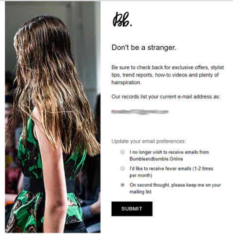
By pairing a friendly message with an attractive image and alternate choices, Bumble & Bumble improves the chances that readers will remain subscribed.
Helpful suggestions like these also create a warm lasting impression, so subscribers remember you fondly.
Another example, below, comes from Bonobos, a menswear company. The brand takes a different approach by offering quite a few choices as an alternative to unsubscribing.
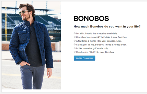
Typically, it’s a bad practice to offer a long list of options on the unsubscribe page. This one's an exception to the rule because the humorous one-liners make it a fun read.
The long list still runs the risk of turning people off, but also balances itself out by leaving a strong positive impression as people are saying goodbye.
6. Offer to personalize their subscription.
Another smart way to approach the unsubscribe process is by offering category-style alternatives. You do this in your email footer or on the unsubscribe confirmation page.
For example, PopSugar, a beauty lifestyle company, displays a large “Tailor Your Newsletter” button in the footer of their emails.
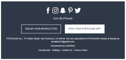
Because the “Tailor Your Newsletter” button stands out, it’s hard not to notice it when you’re looking for the unsubscribe button. The CTA offers a tempting alternative for people who love your company but are just getting too many emails.
When a reader clicks on the CTA, it takes them to a page of options. Instead of a long list of text, the company presents a well-designed page that compels the user to browse alternatives.
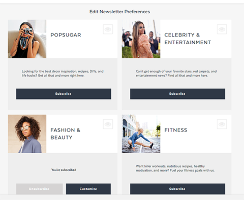
The same process can be used in your unsubscribe forms.
Creating a page that feels like a shopping experience tugs at the interest of anyone who loves to shop.
As long as you make it easy for viewers to click the unsubscribe confirmation, readers won’t mind being offered more options.
NPR News also offers a category options on their unsubscribe page.
When a reader clicks unsubscribe, they’re taken to a page that offers them the option to leave the category or the entire company email list.
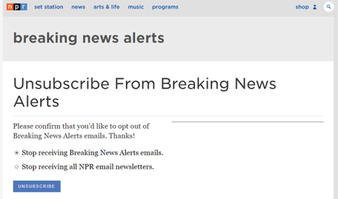
In a thoughtful twist, NPR defaults to a category cancellation. The 2nd choice, “stop all newsletters,” seems like it’s being offered up as a polite courtesy.
7. Include an option that allows readers to change their mind.
Drop a bright red button on your page that says “I’ve changed my mind,” or include a “re-subscribe” button with their final confirmation. Many un-subscribers are hesitant to walk away and never hear from you again.
Be sure you’re continually offering the option to change their mind or return at any time.
For example, Stencil Social Media company includes a cute puppy picture with a “sad day” headline. Then, they add a warm greeting that confirms the cancellation.
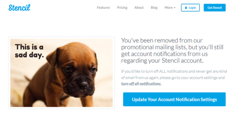
Most importantly, Stencil offers the chance for the reader to re-subscribe by adding a brightly-colored button that reads “Update Your Account Notification Setting.”
How to Say Goodbye to Email Subscribers
Despite your best efforts, people will still choose to cancel their email subscription. When this happens, do the best you can to form a positive and lasting impression.
8. Show some personality, so they don’t forget you.
Be friendly and gracious about saying goodbye, but also be sure to show some personality and style when you part ways. This helps people remember you.
For example, at one time HubSpot Marketing included a humorous video on their unsubscribe page. The man is saying goodbye to readers while mimicking the breakup of a romantic relationship.
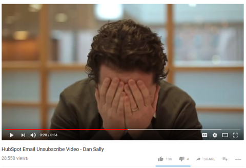
The video opens with the speaker talking in a mockingly sad tone. “Okay. I get it. You don’t want to hear from me anymore. That’s fine. I wanted to make sure you had the best marketing information available.”
It’s a great piece because it’s highly entertaining and nearly impossible to stop watching.
Even if it doesn’t change the person's’ mind, it does a great job of reminding why they loved HubSpot in the first place - and makes them more likely to return.
9. Encourage un-subscribers to follow you on social media.
The option to continue a relationship by following your brand on social media should be included in everyone’s unsubscribe process. Social media is a good way for readers to stay connected to your brand without cluttering their email inbox.
Unsubscribe Pages are An Opportunity
If you are respectful, warm, and helpful during the unsubscribe process, it will work to your advantage because:
- Subscribers may choose to stay connected through a condensed email newsletter or through social media.
- Subscribers might change their mind about canceling their subscription.
- Former subscribers will remember you fondly, and are more likely to recommend your product to friends or resubscribe in the future.
Take the time to design footers, unsubscribe confirmation pages, and goodbye pages that can improve your chances of retaining subscribers.
Keep in mind that their reason for leaving is not normally a personal one, and that cancellations are often a routine process in any email marketing endeavor. They are also an opportunity to reinforce a positive, long-term relationship with potential and returning customers.
