How To Optimize Your App Icon: Could It Shape Your Brand Identity?

How To Optimize Your App Icon: Could It Shape Your Brand Identity?
Are you aiming to shape your brand identity to attract and retain more users? If so, you should consider following the five simple steps in this article, which will enable you to optimize your app icon and add individuality to your visual identity.
In today's competitive mobile app market, where brands constantly fight for user attention, the design and optimization of your app icon play a pivotal role in shaping your brand's identity.
Your icon is the first thing a user sees when they decide to connect with your app, so it must represent the app's offerings in a single, visually appealing element that is memorable and accurate.
This article will explore how an app icon can shape your brand identity and five ways you can optimize your icon for maximum user engagement.
How An App Icon Can Shape Brand Identity
Brands often need to pay more attention to the importance of their app icon and understand how it can effectively convey an app's essence and add individuality to a brand's identity.
As mentioned, your app icon is the first thing a user sees, but unfortunately, they tend to scroll past very quickly. So, the goal is to use a clear, distinct, and straightforward icon to display the purpose of your app.
It should include consistent branding elements used throughout your brand's website and social media pages, such as the color palette (using a signature brand color can boost brand recognition by 80%), typography, and imagery.
Some brands opt for stock icons, which are free and open to anyone, like stock images. However, spending more time creating a custom icon is a better way to mirror your brand's personality and shape how users see and remember your brand.
Some of the most recognizable app icons are Instagram, Netflix, TikTok, and LinkedIn.
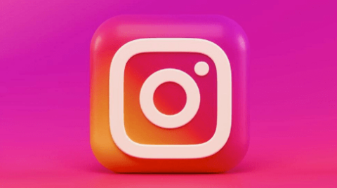
Instagram’s simple yet effective camera design conveys the app's use. In addition, curve designs are more approachable than simple square logos, as they give a friendly feel to the user.
5 Ways Brands Can Optimize Their App Icons
While a well-crafted brand logo is essential for your social media and digital marketing campaigns, well-optimized app icons are the key to enhancing brand identity in your chosen app stores.
Optimizing your app icon is about something other than making it look pretty. You must design an icon that resonates with your desired target audience, informs them of your brand’s offerings, and encourages them to download and use the app.
To increase your app's visibility, drive more downloads, and boost user engagement, follow these five steps for app icon optimization:
- Research industry competitors
- Follow app store guidelines
- Update icons for seasons and holidays
- Create minimalist designs
- Scale your icon for different devices
1. Research Industry Competitors
When crafting an app icon, it's vital to research your industry's competition to understand the larger environment in which your app exists.
For example, if you run a travel planner app, take note of the icon color schemes and design elements used among the top travel planner apps. Understanding these patterns can hint at what does and doesn't work well with your target audience.
Here are three simple steps for conducting competitor research:
- Compile a list of direct competitors and analyze their icons.
- Use tools like App Annie or Sensor Tower to gain insights into trending designs.
- Read through reviews on competitor apps that shed light on what users like or dislike about their app icons.
Incorporating competitor research into your design process ensures your app icon is trendy. However, you must consider whether you want to fit in with your competitors by embracing the most popular color and design trends or break the mold and stand out.
2. Follow App Store Guidelines
Apple's App Store and Google's Play Store have guidelines for app icons to ensure a designer's creation aligns with platform standards and looks cohesive across all apps.
When you follow these guidelines, you optimize the visibility and appeal of your app. Here are some examples of the differences in app store guidelines:
- Sizing standards. The best-suited dimensions of one platform might appear stretched or compressed on another.
- Icon shapes. Android leans towards adaptive icons, which conform to various shapes depending on the device, whereas Apple sticks to its well-known rounded square.
- Design recommendations. Some platforms might be against design elements that can be mistaken for system icons.
- Color recommendations. Some platforms might advise on the usage of shadows or gradients.
Following these guidelines guarantees smoother app store approvals, better app visibility, and a consistent user experience. Ignoring them can result in your app being overlooked or even rejected by the app store.
3. Update Icons for Seasons & Holidays
Changing your app icon to match the seasons or popular holidays can make it feel fresh and timely to users.
For example, adding snowflakes during winter, a Santa hat for Christmas, or using darker colors at Halloween is a simple way to show users your app is updated often and tuned in to what's happening in the world.
However, it would help if you remembered to keep changes subtle so that the core look remains recognizable to existing app users. You don't want your app to get lost on their smartphone home screen because they no longer recognize your branding.
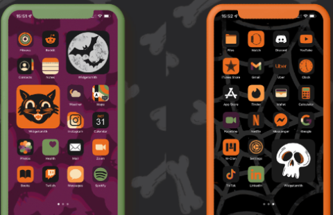
In the example above, the iconography of each app has remained the same, but the colors have changed to orange and black to suit the Halloween theme.
4. Create Minimalistic Designs
With app icons, less is often more. Opting for a minimalistic approach with a single, powerful visual cue can elevate your app's first impression. Here are some ways to create minimalistic icon designs:
- Focus on the essentials. Include one straightforward image that shows the purpose of your app, such as a cloud or sun motif for a weather app.
- Use fewer colors. A palette of just two or three shades is often more impactful than a rainbow. Blue is the most popular primary color for app icons.
- Avoid clutter. Text, intricate designs, and detailed graphics are often seen as confusing.
Each icon should feature a single, easily identifiable object or image, eliminating potential confusion for users. The quicker a potential user understands what your app has inside, the likelier they are to download.
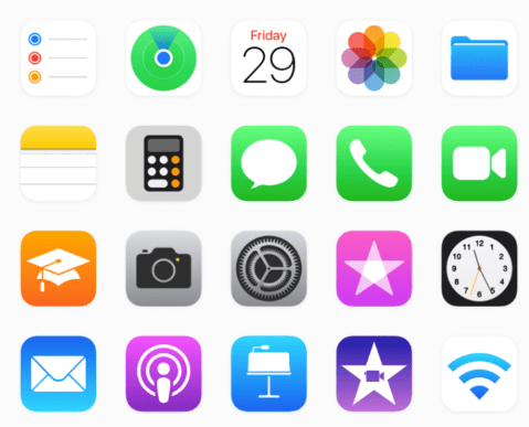
For example, Apple's native apps are instantly recognizable due to their straightforward designs and singular symbols, leaving no doubt about their purpose. The Camera app is a camera, the Calendar app is the date, the Mail app is an envelope, the Notes app is a blank notebook, and the Clock app is a clock face.
5. Scale Your Icon for Different Devices
Users can now access apps from a wide range of screen sizes, including tablets, smartphones, and smartwatches. Therefore, your app icon must adapt to different sizes.
It's essential to correctly adapt and scale your app icon - not shrink it, as this results in lost details and an unrecognizable mess.
On a larger screen like a tablet, you can use a more intricate design, but on a smartwatch, you must condense the essence of your app so the core element is the key visual for users.
Remember to test your app icons across various real devices. Sometimes, what looks good on your developer's high-resolution monitor may look different on a smartphone.
Optimizing Your App Icon To Shape Brand Identity
Understanding how to optimize your app icon is important in creating something that builds and maintains a strong brand identity.
So, whether you're designing it yourself or using an app developer, ensure your app icon is memorable, stands out from competitors, and follows app store guidelines.
Hire a branding agency to support your company's vision.

Neve Wilkinson
Content Writer, Solvid