5 Web Design Tips for Beginners

5 Web Design Tips for Beginners
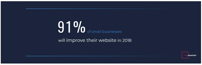
91% of small businesses planned to upgrade their website in 2018. Here are five tips to help you improve your user experience and boost engagement - no matter the time period.
Updated September 11, 2023
In website design, beauty is in the eye of the scroller. If your website is easy to use and navigate, it will be more likely to succeed with users and on search engines.
A website or web page should clearly communicate what you do, how you do it, and its intended audience. If this isn’t evident to users within seconds, it’s time to optimize your web design and functionality.
You’re not alone. A survey found that nearly all (91%) small businesses planned to upgrade their website in 2018. After all, website’s are complicated and there’s always room for improvement on the road to high quality.
5 Website Design Tips
Follow these five web design tips to create a remarkable user experience (UX) that will hook prospects, nurture leads, and drive revenue:
- Plan your website
- Use appropriate calls-to-action
- Choose quality images
- Ensure easy navigation
- Design with visual hierarchy
Hire a website design team to deliver a good web design for your business website.
1. Plan Your Website
Begin your responsive design strategy with the end in mind.
Before you can convert customers, the website’s user experience (UX) must deliver the answers users want. This means that each web page should align with your audience’s buyer’s journey while having a user-friendly look and feel.
Ensure you’re addressing the right pain points by asking:
- What value proposition will be most alluring on the homepage?
- What web pages will be viewed by new visitors?
- What offer will draw the most conversions?
- What content will best inform a purchase decision?
Your website is like a conversation. Aim to address your customer’s questions as they would arise – preferably before they can think to ask them. This will create an intuitive site experience that nurtures users down the sales funnel.
Existing customer data will be critical in understanding your audience’s thought process. Research and interview your user base if you lack this data. Then redesign your site around what your customers want.
2. Use Appropriate Calls-to-Action
A call-to-action button (CTA) is a page element that prompts users to take the next step. Without them, users will fail to convert.
“For your CTAs to work, two things need to happen,” says Tim Ash, CEO of SiteTuners. “First, visitors need to be able to spot them without any effort. Second, visitors must instantly know what they do.”
Clarity is definitely key – but so is context. Top-of-funnel (TOFU) website elements that appeal to first-time or recent visitors must be aligned with TOFU calls-to-action, and vice versa.
Say a prospect finishes an introductory blog post and finds a CTA to “Start the free trial.” Obviously, a new prospect isn’t ready for a trial and won’t convert.
However, a free webinar, social media video, or ebook offer could be very effective at this stage. Pairing resources to the reader’s current pain points will position you as a trusted authority. This trust can later be translated into a sale.
For example, this homepage CTA from invites the visitor to “Explore the Unbounce Platform.”
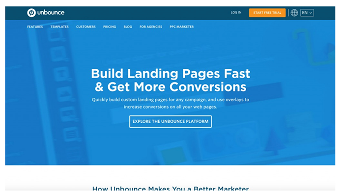
The language here is welcoming and perfectly attuned to a first-time visitor. Once the lead becomes more familiar with the Unbounce product, a mid- or late-funnel CTAs – such as “Start your free trial” or “Begin your subscription” – will become relevant.
To pull leads down the marketing funnel, use calls to action that are specific to the prospect’s position in the buyer’s journey.
3. Choose Quality Images
Yes, stock images are free and beautiful. However, they will be immediately identified as such and ignored by your audience.
Research from Nielsen Norman found that people immediately recognize stock images and find them inauthentic.
Better to use genuine images that evoke trust for your business. Photos of people at your company are ideal. These images will give your website’s look an extra push in the eyes of potential customers.
Fact is, people love to look at other people – especially their faces. Any page with a face instantly becomes more personal and more human.
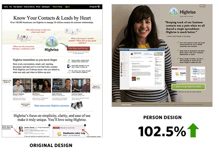
If you’re like Basecamp, adding a smile to your landing page could increase your conversion rate by almost 103%.
We’re so attracted to the human face that we use the eyes of others as visual cues. A famous case study by James Breeze found that website visitors will follow the eyes of those in the images.
You can use this to focus users’ attention toward your headlines, CTAs, or other pages elements of your web design. Other elements in the design process can impact the view of images like choosing the right typography and font for subheadings and body text, and using the right background color that fits with your company’s color scheme.
When it comes to photos, opt for authenticity over polish. However, if you must use stock photos, here’s a guide to achieve maximum realism.
4. Ensure Easy Website Navigation
Great websites make it easy for visitors to find what they want - this is one of the fundamentals of having a professional website design. If your site navigation is confusing, people will bounce in search of better UX.
This is partly why 16% of surveyed small businesses planned to invest in website user experience in 2018. Site navigation is a great investment because it improves engagement, promotes conversions, and reduces bounce rates.
Navigability begins with the header on your homepage. Be descriptive with your navigation headers, as users will scan here and then decide how to proceed. Navigation also touches menu items & sliders, screen sizes, and other design elements that improve loading time and reduce bounce rates.
Generic labels are a missed opportunity to communicate the benefits of your site. The example below illustrates how informative a navigation bar can be.
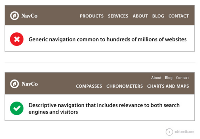
Unique headers like these help improve the UX, but also improve your search rankings.
Here are a few other ways to improve your overall site navigation:
- Link your logo to the homepage: Visitors like to use the logo to return to the starting point.
- Add a page footer: The footer is last thing seen on any page. Use it to direct users to all relevant links, including a shortened version of your menu, terms of use, social icons, and any other relevant site locations.
- Use in-page (anchor) links: If your pages are lengthy and require lots of scrolling, anchor links text can enhance page usability and navigability. Basically, these links allow users to jump around the page. Examples of anchor text include a table of contents, sticky navigation bar, back-to-top links, or an FAQ area.
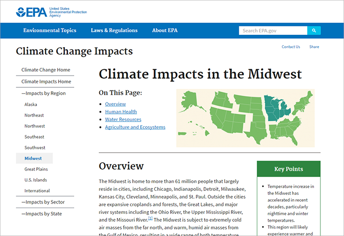
For example, The Environmental Protection Agency’s website uses in-page links to direct readers through lengthy reports.
Businesses must streamline their website’s navigation to ensure users can quickly find they are looking for. Don’t forget to make your website design user-friendly on mobile devices and smartphones as well!
5. Design with Visual Hierarchy
A website has just seconds to grab the visitor's attention. Visual hierarchy is what allows you to immediately focus someone’s attention to the important areas of your website.
Visual elements like size, color, contrast, and white space should all be considered. The relative prominence of these components will determine the order in which they're seen by the eye.
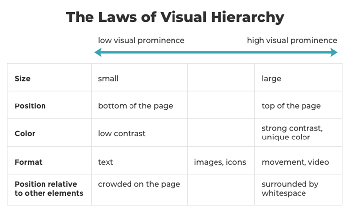
These design elements can be layered to compound their effects. In the following example, the use of color blocking, large text, and empty space creates a bold, interesting, and accessible homepage.
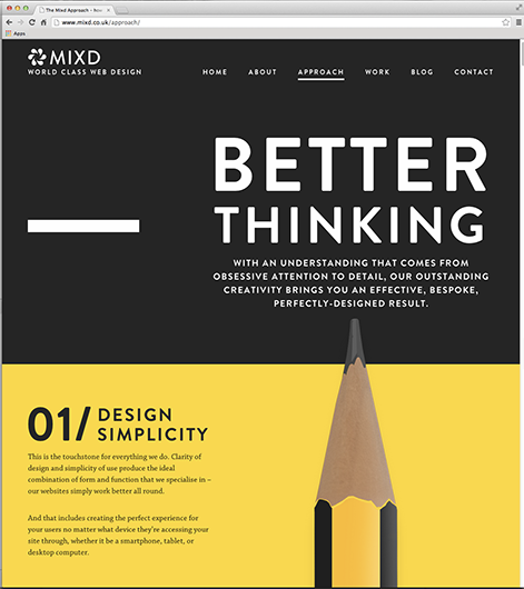
The bold contrast of yellow and black moves the reader between sections and helps to improve readability. An oversized pencil guides the eye downward while providing a counterweight to the quadrant design format.
Visual hierarchy accentuates key page elements, resulting in an inviting and rewarding UX.
Web Design for Beginners
Optimizing your web design hinges upon improving your website’s UX. These web design tips for beginners provide a solid foundation for creating visually appealing and user-friendly websites. By focusing on responsive design, simplicity, and consistency, beginners can ensure that their websites are accessible and engaging across different devices and platforms.
Attention to typography, color schemes, and whitespace allows for a visually pleasing and easy-to-read layout. Additionally, understanding the importance of navigation and usability ensures that visitors can easily find what they need on the website. Seek out ways to make your site more usable, navigable, and enjoyable.
With these tips in mind, beginners can confidently embark on their web design journey, creating effective and impactful online experiences with a great design.

Ian Heinig
Writer, Clutch
Ian Heinig is a copywriter who loves big ideas, brand strategy, and psychology. Most days he's drafting new ways to share value, but he's also an illustrator, yogi, and freelance burrito analyst. Find him at radicalartsdepartment.com.